- About us
-
Services
- Back
- Development Services
-

-
-
-
- Designing Services
-
-
-
-
- Marketing Services
-
-
-
-
- Cloud Engineering Services
-
-
-
- ERP
-
-
-
- CRM
-
-
-
- Artificial Intelligence
-

-
-
-
- MVP
-
- Industry
- Portfolio
- Career
- Contact us
-
 info[at]startdesigns.com


Introduction: Why Reactive Web Design is the Future
In today’s fast-paced digital world, users expect web apps to feel instant, responsive, and smooth. Slow-loading pages or janky interfaces lead to high bounce rates, lower engagement, and lost revenue.
Reactive Web Design (RWD) is a design and development philosophy that ensures your web apps always feel fast, even on slow networks. Unlike traditional responsive design that merely adjusts layout for different screen sizes, reactive design focuses on perceived performance and user experience, making every interaction feel immediate.
By combining reactive techniques, frameworks, and automation, you can create web apps that are beautiful, functional, and lightning-fast, giving your business a competitive edge globally.
Why Reactive Web Design Matters
Perceived performance matters more than raw speed. Studies show:
- Users perceive websites with skeleton screens as 50–80% faster than traditional page loads.
- A delay of just 100 milliseconds can reduce engagement and conversion.
- On mobile networks, slow or unstable loads lead to 30–50% higher bounce rates.
Reactive Web Design doesn’t just improve speed; it enhances trust, usability, and retention, all critical KPIs for modern web apps.
Key Benefits:
- Immediate responsiveness to user actions
- Smooth content transitions with minimal “jumps”
- Improved accessibility and UX
- Higher engagement and conversion metrics
- Better adaptability for global audiences with varying network speeds
Core Techniques for Reactive Design
1. Skeleton Screens: Instant Perceived Loads
Skeleton screens are placeholder layouts that show the structure of content while actual data loads in the background.
How it works:
- User clicks a button or link.
- Page responds instantly by showing a skeleton screen.
- Actual content fills in as soon as it’s available.
Example Code:
<div class="skeleton">
  <div class="skeleton-thumbnail"></div>
  <div class="skeleton-text"></div>
  <div class="skeleton-text short"></div>
</div>
Real-World Examples:
- Facebook: Skeletons on feed posts make scrolling feel instantaneous.
- Flipkart: Product lists load instantly with skeleton placeholders for images and titles.
- Medium: Shows greyed-out blocks for article previews while content loads.
Benefits:
- Reduces perceived wait time
- Keeps users engaged during slow network responses
- Avoids “Is it loading?” confusion
2. Stable Loads: Prevent Page Jumps
Unstable loads occur when images, ads, or dynamic content load without predefined sizes, causing layout shifts.
How to fix it:
- Always define
widthandheightattributes for<img>tags. - Reserve space for ads and dynamic content using CSS.
- Pre-calculate sizes for dynamic images on upload.
Example Code:
<img src="thumbnail.png" width="200" height="150" alt="Product Image">
<div class="ad-container" style="width: 300px; height: 250px;"></div>
Real-World Examples:
- Slate.com (problematic) vs Flipkart.com (stable)
- Mobile-first sites benefit most since slow networks exaggerate jumps.
Benefits:
- Prevents layout shifts
- Improves user confidence
- Boosts Core Web Vitals (CLS metric)
Reactive vs Responsive Web Design
| Feature | Responsive Design | Reactive Design |
|---|---|---|
| Layout | One flexible layout adapts | Multiple versions per device |
| Asset Loading | All assets for all devices | Only relevant assets load |
| Performance | Medium, may slow on mobile | Optimized per device |
| Development | Simpler, single codebase | More complex, multiple templates |
| UX | Uniform experience | Tailored per device |
| Content | Shared across devices | Can be customized per device |
Takeaway:
- Responsive is simpler and works well for content-focused sites.
- Reactive excels for web apps, ecommerce, media-heavy sites, and global audiences.
Step-by-Step Guide to Implement Reactive Design
Step 1: Choose the Right Framework
- React, Vue, Angular → component-based, reusable architecture.
- Svelte → lightweight, highly reactive runtime.
Step 2: Implement Skeleton Screens
- Create placeholder components for all dynamic content.
- Use animations or shimmer effects for realism.
- Test on slow network emulation (Chrome DevTools → Network Throttling).
Step 3: Prevent Layout Shifts
- Define all element dimensions in HTML/CSS.
- Preload fonts to avoid flashes.
- Reserve ad spaces with fixed dimensions.
Step 4: Optimize Asset Loading
- Lazy-load images/videos.
- Use responsive images (
srcset) for multiple screen sizes. - Minify JS/CSS and leverage caching/CDN.
Step 5: Hybrid Approach
- Use responsive design for content-heavy sections (blogs, landing pages).
- Apply reactive design for interactive components or web apps.
- Synchronize shared content via API or CMS.
Global Examples of Reactive Design
- Flipkart: India’s ecommerce giant uses skeletons for product listings.
- Netflix: Preloads personalized content per device.
- Airbnb: Custom layouts and interactive maps tailored to device and location.
- Alibaba: Optimized for high network latency regions.
These examples show that reactive design is not just about speed, but enhancing global accessibility and UX.
AI & Automation in Reactive Design
AI is transforming reactive web design by:
- Dynamic personalization: Tailor content per user/device in real-time.
- Predictive loading: Preload content users are likely to click.
- Performance monitoring: Use AI to auto-optimize images, assets, and skeletons.
Tools & Approaches:
- Headless CMS + AI content API
- AI-powered testing platforms for UX and speed
- ML-based analytics to determine user behavior patterns
SEO & Analytics Considerations
- Responsive sites: One URL, simple SEO, easier indexing.
- Reactive sites: Requires canonical tags, 301 redirects, proper sitemap.
- Analytics: Track user engagement per device for granular insights.
- Core Web Vitals: Skeletons + stable loads improve LCP and CLS scores → better Google ranking.
Future Trends
- AI-powered reactive frameworks that automatically personalize content and layout per visitor.
- Hybrid models: combine reactive personalization with responsive consistency.
- Server-side rendering + client-side hydration → faster perceived loads.
- Globalized performance: targeting multiple regions with variable networks.
Frequently Asked Questions (FAQ)
Q1: Is reactive design better than responsive for SEO?
- Both can rank well if implemented correctly. Use canonical URLs for reactive templates.
Q2: Does skeleton screens impact speed?
- They improve perceived speed, even if actual load time is the same.
Q3: Can small websites use reactive design?
- Generally, responsive design is enough. Reactive is best for complex apps or large content sites.
Q4: Which frameworks support reactive design?
- React, Angular, Vue, Svelte, and Next.js are popular choices.
Q5: Can AI fully automate reactive web design?
- Emerging tools can dynamically assemble layouts and optimize assets per user, but human oversight is still needed.
Conclusion
Reactive Web Design is no longer optional, it's essential for high-performance, global-ready web apps. By combining skeleton screens, stable loads, hybrid responsive-reactive approaches, and AI automation, you can deliver lightning-fast, smooth, and engaging web experiences.
Global businesses that adopt reactive design increase engagement, improve conversions, and stay ahead of competitors. Whether you’re building ecommerce platforms, media-heavy apps, or interactive tools, reactive principles are the key to future-ready web development.
About the author


Popular Posts

Why Cheap Responsive Web Design Fails: 15 Checks Before Hiring a Web Design Company
June 19, 2026- 19 Min Read
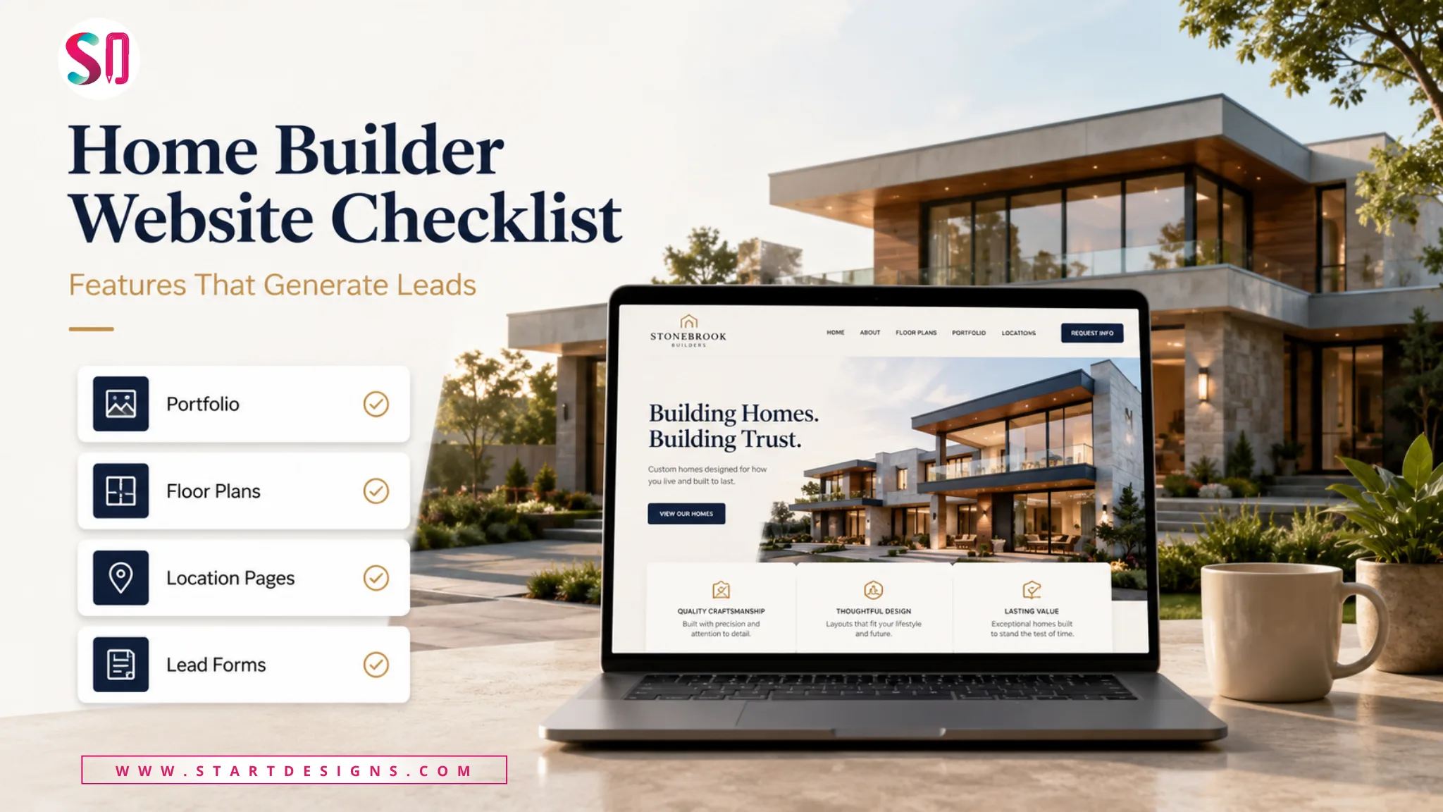
Home Builder Website Design Checklist: 25 Features That Generate Leads
June 17, 2026- 12 Min Read

CBD Website Design: Complete Guide for CBD Brands & Ecommerce Stores
June 11, 2026- 17 Min Read