- About us
-
Services
- Back
- Development Services
-

-
-
-
- Designing Services
-
-
-
-
- Marketing Services
-
-
-
-
- Cloud Engineering Services
-
-
-
- ERP
-
-
-
- CRM
-
-
-
- Artificial Intelligence
-

-
-
-
- MVP
-
- Industry
- Portfolio
- Career
- Contact us
-
 info[at]startdesigns.com


Your restaurant's food might be absolutely incredible, but if a visitor lands on your website and bounces in three seconds, that table never gets booked. That's the hard truth. Studies show that 77% of diners visit a restaurant's website before deciding where to eat, and you have roughly 7 seconds to make a strong first impression.
I've spent years analyzing restaurant websites. some so good they made me want to book a table on the spot, and others so frustrating I closed the tab without a second thought. In this guide, I've handpicked 20 of the best restaurant website examples for 2026. For every single one, I'll break down:
- Exactly what makes this website stand out from the competition
- Which specific design or UX technique you can apply to your own site
- What type of restaurant owner will benefit most from this example
Whether you're running a neighborhood pizza spot or a Michelin-starred tasting menu, there's something in here for you. Let's get into it.
What Makes a Great Restaurant Website?
Before we dive into the examples, let's establish a quick framework. A great restaurant website does three things immediately and clearly, it tells visitors what you serve, where you are, and how they can reserve a table or place an order. If those three things aren't obvious within five seconds of landing on your homepage, the website is working against you.
1. Page Speed — The Foundation Everything Else Sits On
Google's own data shows that 53% of mobile users abandon a page that takes longer than 3 seconds to load. For restaurants, this is even more critical, people are often searching on the go and making quick decisions. Compress your images, cut unnecessary plugins, and invest in solid hosting. Speed is a baseline expectation now, not a bonus.
2. Mobile-First Design — Your Customers Are on Their Phones
More than 72% of restaurant-related searches happen on mobile devices. That means buttons need to be large enough to tap comfortably, text needs to be readable without zooming, and your menu needs to scroll cleanly, not as a tiny, pinch-to-zoom PDF. If your site isn't built for mobile first, you've already lost a significant portion of your potential customers before they've read a single word.
3. Menu Visibility — One Click Away, Not Five
This is the single most common mistake I see on restaurant websites. Your menu should be accessible from the homepage in one click, ideally visible without even scrolling. Never upload your menu as a PDF. PDFs are a nightmare to navigate on mobile, they don't get indexed properly by Google, and they create unnecessary friction between your visitor and the information they came for. Use an HTML menu that's responsive and readable on any device.
4. High-Quality Food Photography — Sell the Experience Before They Arrive
Your food photography is the most powerful marketing asset you have. Professional photos signal quality, care, and attention to detail. A single great hero image can do more for your reservation rate than any amount of clever copywriting. If a professional photographer isn't in the budget, natural light and a modern smartphone can still produce compelling results — just avoid anything blurry, dark, or poorly framed.
5. Location and Hours — Make It Obvious, Not a Treasure Hunt
This sounds basic, and yet it's surprising how many restaurant websites bury this information in the footer. Your address, phone number, and hours should be visible above the fold — ideally in the header or the hero section. Embed Google Maps. This also has a direct impact on your local SEO performance, so it's not just a UX decision.
6. Reservations and Online Ordering Integration
In 2026, if your website doesn't offer a direct path to booking a table or placing an order, you're leaving real money on the table. Integrate tools like OpenTable, Resy, or a native online ordering system. Every extra step a customer has to take reduces the likelihood they'll follow through. Remove the friction, and your conversion rates will follow.
20 Best Restaurant Website Examples (2026) — With Design Breakdowns
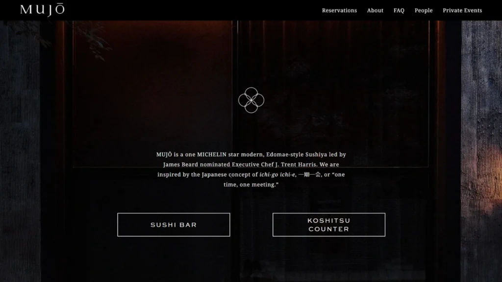
1. Mujo Atlanta — Omakase Sushi | Atlanta, GA
Website: mujoatlanta.com
Why It Works: Minimalism is their competitive advantage. A single object, a single frame, a single dish. You immediately feel the luxury without a word being written. The 'less is more' philosophy works here because every element on the page is intentional.
The above-the-fold area is just one stunning image and the restaurant name. No clutter, no noise. This keeps the visitor's attention undivided and the brand reads as premium instantly.
Their color palette is limited to two or three carefully chosen tones that appear consistently across every page. That brand consistency builds trust and signals professionalism before a single menu item is seen.
Key Feature to Steal: Simplify your hero section. One strong image, your restaurant name, and a single CTA — Reserve or View Menu. Nothing else needs to be there.
Best For: Fine dining, omakase, wine bars — any concept where exclusivity and elevated experience are central to the brand.
2. BoccaLupo — Italian Trattoria | Atlanta, GA
Website: boccalupoatl.com
Why It Works: This site proves that simple can be highly effective. Contact information and hours are prominently displayed at the top of the page, which means the visitor's first question — where are you and when are you open — gets answered immediately.
The font choices and layout carry a playful, casual energy that matches their neighborhood-friendly vibe perfectly. This is what it looks like when a website actually captures a restaurant's personality instead of just describing it.
There are no unnecessary animations or flashy elements. The result is a page that loads fast and communicates clearly. Restraint is a design choice, and they make it well.
Key Feature to Steal: Move your hours and address out of the footer and into your header or hero section. That single change can meaningfully improve how many visitors convert into customers.
Best For: Neighborhood restaurants, casual dining spots, family-owned eateries with a strong local identity.

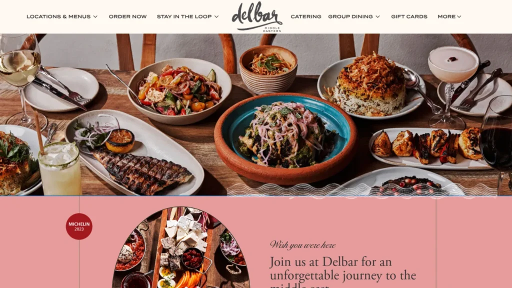
3. Delbar — Modern Persian | Atlanta, GA
Website: delbaratl.com
Why It Works: Delbar's physical space is rich with texture, warmth, and personality their website mirrors that experience precisely. The connection between the online impression and the in-person reality is something most restaurants completely overlook, but it's a powerful trust signal.
Textures, layered patterns, and a warm color palette create an immersive browsing experience. After a few seconds on this site, the visitor can almost feel what it'll be like to sit down inside the restaurant.
The photography shows the space, tables, lighting, interior details, not just the food. Selling the ambiance is just as important as selling the dishes, and this website understands that instinctively.
Key Feature to Steal: When you shoot photography for your website, don't only photograph the food. Capture your dining room, your lighting, your textures. Ambiance is a product you're selling too.
Best For: Restaurants with distinctive interiors, concepts where atmosphere is a core part of the experience.
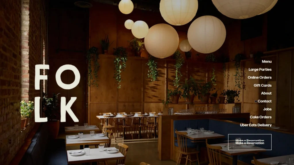
4. Folk — Artisan Pizzeria | Nashville, TN
Website: folkpizza.com
Why It Works: The homepage uses progressive image tiles where clicking each one takes you directly to that section of the menu. It's a brilliant navigation solution, visitors get where they want to go without extra steps, and the design feels intuitive rather than clever for its own sake.
Large, bold headings immediately communicate what's on offer. No guesswork. This is 'clarity over creativity' done right, a visitor knows exactly what kind of restaurant this is within two seconds of landing.
The visual hierarchy is strong enough that your eye naturally flows to the most important information first. This is a fundamental UX principle that most restaurant websites fail to apply consistently.
Key Feature to Steal: Add clickable menu category tiles to your homepage. Let visitors jump to Starters, Mains, Drinks, or Desserts with a single tap. Removing steps from the path to information reduces bounce rates.
Best For: Pizzerias, casual dining, fast-casual restaurants with menu variety worth showcasing.
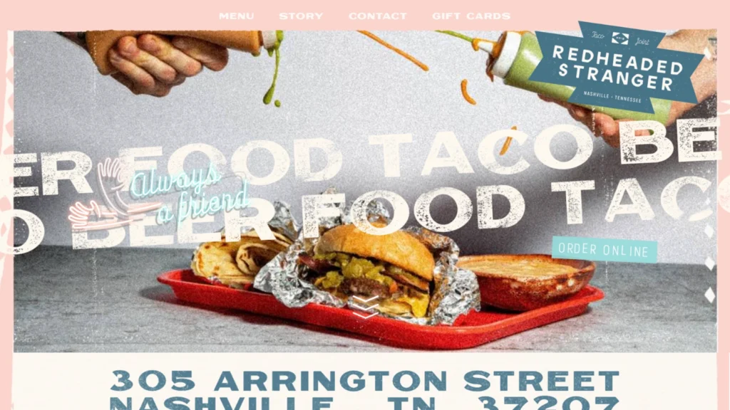
5. Redheaded Stranger — Tex-Mex | Austin, TX
Website: redheadedstranger.com
Why It Works: Scrolling text, rich textures, and subtle GIFs, this website has all of it, and somehow it doesn't feel overwhelming. Hitting that balance is genuinely difficult, and they've nailed it. The design feels alive without being chaotic.
The address is displayed prominently at the very top of the page. For restaurants with a strong local following, location visibility is a conversion driver, not just a courtesy.
The restaurant's personality comes through in every design decision, the typeface, the color choices, the tone of the copy. It's unmistakably Texan and unmistakably theirs. That kind of brand identity is a major differentiator.
Key Feature to Steal: Pick one bold, distinctive design element that reflects your restaurant's personality and commit to it throughout the entire site. Consistency turns a style choice into a brand.
Best For: Bars, casual gathering spots, neighborhood joints with a strong sense of humor and local character.
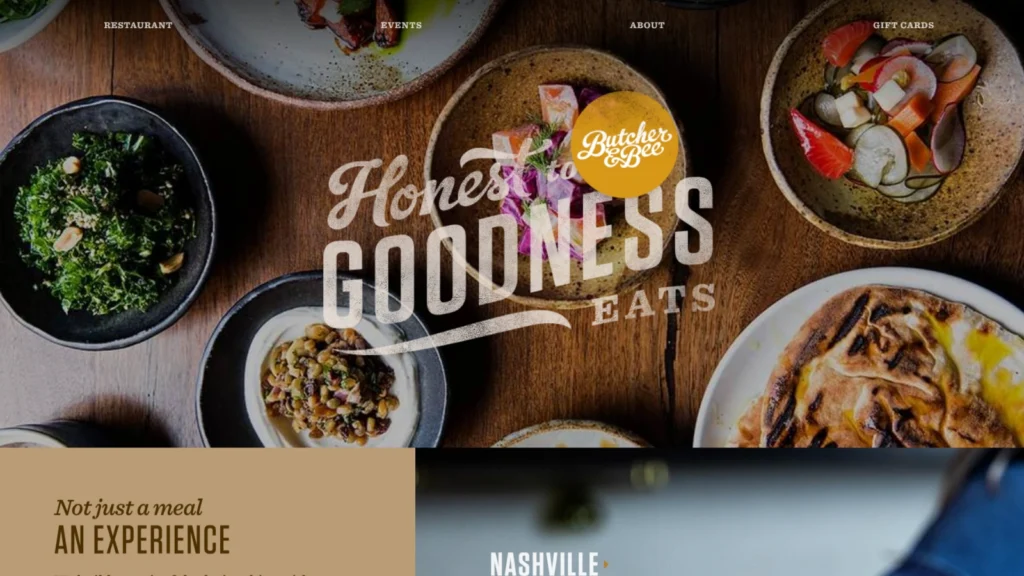
6. Butcher & Bee — Mediterranean | Nashville, TN
Website: butcherandbee.com
Why It Works: The photography is exceptional, but what makes this site stand out is how those images are deployed, not in a generic hero slideshow, but woven throughout the layout in a way that keeps the page dynamic and engaging as you scroll.
The variety in layout and texture gives the visitor a reason to keep scrolling. This directly increases dwell time, which is an indirect quality signal that search engines pick up on.
All the essential information is present menu, location, hours but none of it feels like an afterthought. Form and function are in genuine balance, and that's rare.
Key Feature to Steal: Replace your hero slideshow with editorial-style imagery integrated throughout the layout. Each section gets its own visual moment rather than everything competing in a rotating banner.
Best For: Chef-driven restaurants, farm-to-table concepts, Mediterranean cuisine with a strong culinary identity.
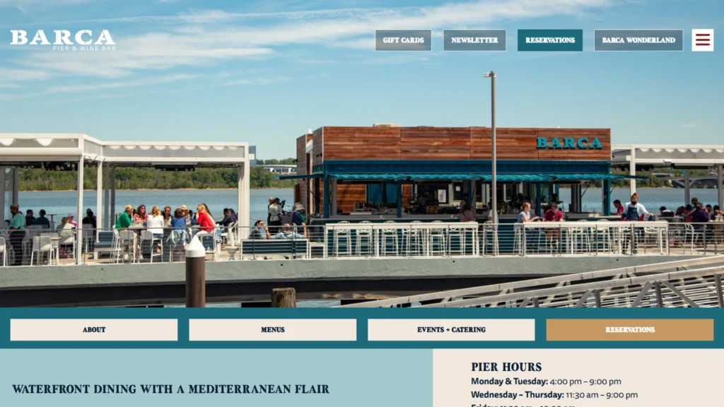
7. BARCA Pier & Wine Bar — Wine Bar / Seafood | Long Beach, CA
Website: barcapierwine.com
Why It Works: The layout breaks convention in the best way, rotating food photos on the left, all key information on the right. It's unconventional but not confusing. The visitor always knows where to look, and the structure guides them naturally.
The split-screen format leverages a simple psychological principle: visual attraction draws the eye first (photos), then logical processing follows (details). It feels intuitive even if you can't explain why.
Their waterfront pier location is a genuine selling point, and the photography makes that clear immediately. The view is part of the product, and the website leads with it unapologetically.
Key Feature to Steal: If your restaurant has a special setting, waterfront, rooftop, historic building, that location should be front and center in your photography. Location is a product feature, not just an address.
Best For: Wine bars, waterfront dining, rooftop restaurants, any concept where atmosphere and setting drive the reservation decision.
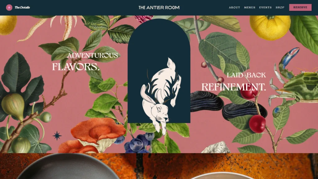
8. The Antler Room — New American | Kansas City, MO
Website: theantlerroomkc.com
Why It Works: The homepage features direct quick-links to each individual menu — food, cocktails, brunch, wine. This single design decision dramatically improves the experience for visitors who arrive with a specific intent.
The design has a distinct personality that matches what you'd expect from reading the menu descriptions. When your website and your restaurant feel like the same entity, it builds confidence before a visitor ever walks through the door.
Despite the personality-driven design, the information architecture is clean. You can find what you need quickly. Character and clarity aren't mutually exclusive, and this site proves it.
Key Feature to Steal: If you offer multiple menus — lunch, dinner, brunch, happy hour, seasonal — link to each one directly from your homepage. Don't make visitors navigate a general menu page to find what they're after.
Best For: American restaurants, cocktail bars, brunch-forward concepts with distinct personalities.
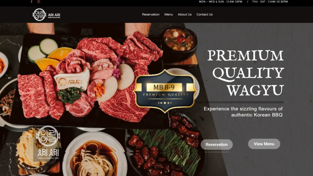
9. Ari Korean BBQ — Korean BBQ | Multiple Locations
Website: arikoreanbbq.com
Why It Works: The hero banner displays meat and banchan arranged in a way that mirrors exactly how food appears on the table during a Korean BBQ experience. It's visual storytelling that communicates the dining format without a single word of explanation.
The design is fun and energetic without crossing into sensory overload. That balance matters — especially for a concept with a lot of visual components competing for attention.
The warm color palette reflects the heat, the communal energy, and the joy of the dining experience. Color psychology is at work here, subtly enough that you feel it before you notice it.
Key Feature to Steal: Choose a hero image that reflects the actual experience of dining at your restaurant — not just a single dish on a white plate. Show the table setup, the energy, the environment. Sell the occasion.
Best For: Korean BBQ, hot pot, shabu-shabu, communal dining concepts where the format is as important as the food.
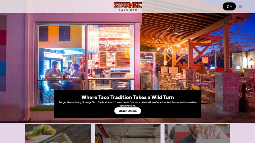
10. Strange Taco Bar — Taco Bar / Mexican | Multiple Locations
Website: strangetacobar.com
Why It Works: Bright, bold colors saturate the entire site and align perfectly with the brand personality. Every visual decision reinforces the same message: this place is fun, colorful, and unpretentious. Consistency like this is what turns a decent brand into a memorable one.
A fixed bottom navigation bar sits persistently on screen during mobile browsing, giving users access to key links without having to scroll back to the top. It's a small detail that makes a noticeable difference in mobile usability.
Every photo is original, vibrant, and specific to their brand. There's not a single stock image in sight, and you feel the authenticity of that immediately.
Key Feature to Steal: Add a fixed bottom navigation bar for mobile users. It's one of the most underrated UX improvements available to restaurant websites, and it measurably reduces the effort required to navigate.
Best For: Taco joints, colorful fast-casual concepts, food trucks making the jump to brick-and-mortar.
11. Nobu — Japanese Fusion Fine Dining | Worldwide
Website: noburestaurants.com
Why It Works: Despite being a global brand with dozens of locations, Nobu maintains a local feel on each individual location page. Specific photos, details, and content make each page feel distinct rather than templated — which is incredibly difficult to achieve at this scale.
Black-and-white photography throughout communicates luxury and timelessness. Every image is editorial in quality and consistent in aesthetic. When you have this many locations, consistency becomes the brand statement.
The navigation is remarkably clear given the complexity being managed — multiple countries, dozens of locations, multiple menus. Complex information architecture can still be intuitive when it's designed with care.
Key Feature to Steal: If you have multiple locations, build individual pages for each one with unique content and local-specific photos. Don't use a generic template — Google rewards specificity, and so do customers.
Best For: Multi-location fine dining, luxury hospitality brands, internationally recognized restaurant groups.
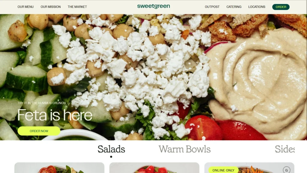
12. Sweetgreen — Healthy Fast Casual | US-Wide
Website: sweetgreen.com
Why It Works: The website feels more like a polished app than a traditional restaurant site. Online ordering is woven seamlessly into the design — it's not an afterthought or a button you have to hunt for. The entire experience is built around conversion.
Mission and sourcing values are featured prominently throughout the site. Modern diners increasingly choose brands that align with their values, and Sweetgreen understands that transparency is a genuine competitive advantage.
Individual ingredients are photographed and featured in ways that emphasize freshness and quality. For health-conscious customers, seeing the sourcing influences the purchase decision significantly.
Key Feature to Steal: Place your online ordering or delivery CTA in your hero section — not the sidebar, not the footer. Shorten the path between intent and action as much as possible.
Best For: Health-focused concepts, build-your-own bowl or salad restaurants, fast-casual brands with a clear dietary identity.
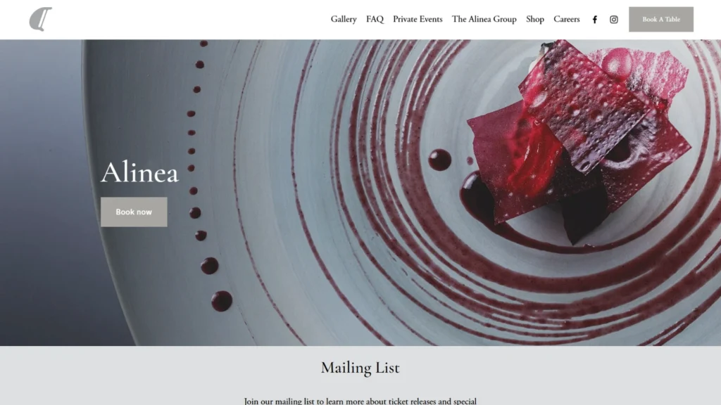
13. Alinea — Modern Avant-Garde | Chicago, IL
Website: alinearestaurant.com
Why It Works: Almost no text exists on this website — the imagery carries everything. This level of restraint reflects extreme confidence in the brand. Alinea doesn't need to explain itself to its target audience.
The reservation system is front and center because that's the only conversion goal that matters for this restaurant. Every design decision supports that single objective. When you know your goal, you design around it.
Typography is minimal but impeccably chosen. The font alone communicates experimental, artistic, and exclusive — before a single dish is revealed. Typography is branding, and this site is proof of that.
Key Feature to Steal: Identify your primary conversion goal and design your homepage ruthlessly around it. For most restaurants it's reservations or orders — make sure there's a direct, obvious path to that action the moment the page loads.
Best For: High-end fine dining, Michelin-starred tasting menus, destination dining experiences.
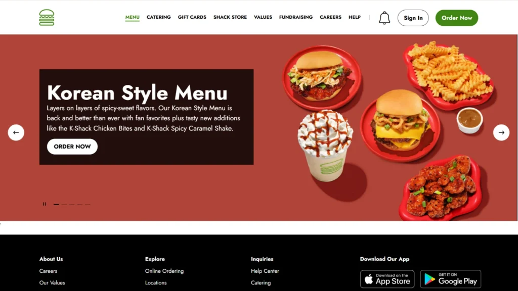
14. Shake Shack — Premium Burgers | US & International
Website: shakeshack.com
Why It Works: A bright, clean design that balances fast-casual energy with a premium brand feel. The visual hierarchy is nearly flawless — your eye goes exactly where it's supposed to go, in exactly the right sequence.
Menu items are showcased with photography that makes the ordering decision easier. Images are consistent in quality and style across the entire menu, which signals professionalism and care for the product.
The location finder is prominent and frictionless. For a brand with this many locations, making it easy to find the nearest one is a basic but critical UX requirement that many multi-location brands still get wrong.
Key Feature to Steal: Use high-contrast food photography that makes your product the hero of the frame. Keep the background neutral so the dish stands out. Consistency across all menu photos matters as much as individual quality.
Best For: Burger concepts, premium fast-casual, multi-location brands building national recognition.
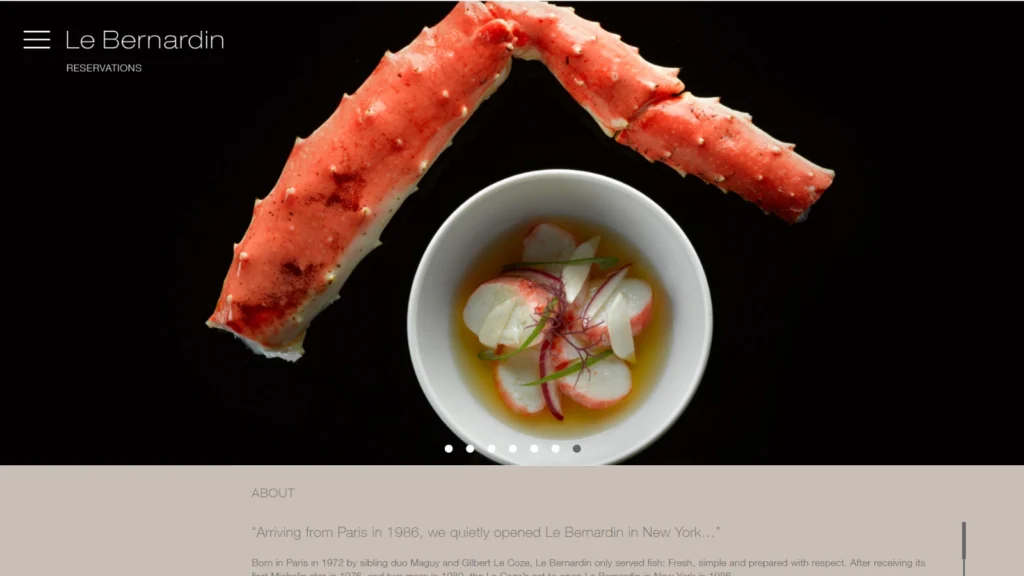
15. Le Bernardin — French Fine Dining / Seafood | New York, NY
Website: le-bernardin.com
Why It Works: Understated elegance at its finest. Dark backgrounds with carefully placed light elements communicate luxury without explanation. The restraint is entirely deliberate and entirely effective.
Press accolades and awards are woven into the design — not hidden on an About page, but present and visible. Social proof at this level is what tips the reservation decision for first-time visitors who aren't already familiar with the name.
Even for a restaurant this exclusive, the online reservation path is direct and frictionless. The more premium the experience, the more important it becomes to remove friction from the booking process.
Key Feature to Steal: Feature your press coverage, awards, and accolades visually — not buried in a text list. A James Beard Award or a Michelin star displayed prominently in your hero section is one of the most powerful trust signals available to a restaurant.
Best For: Award-winning fine dining, celebrity chef restaurants, destination dining experiences in major cities.
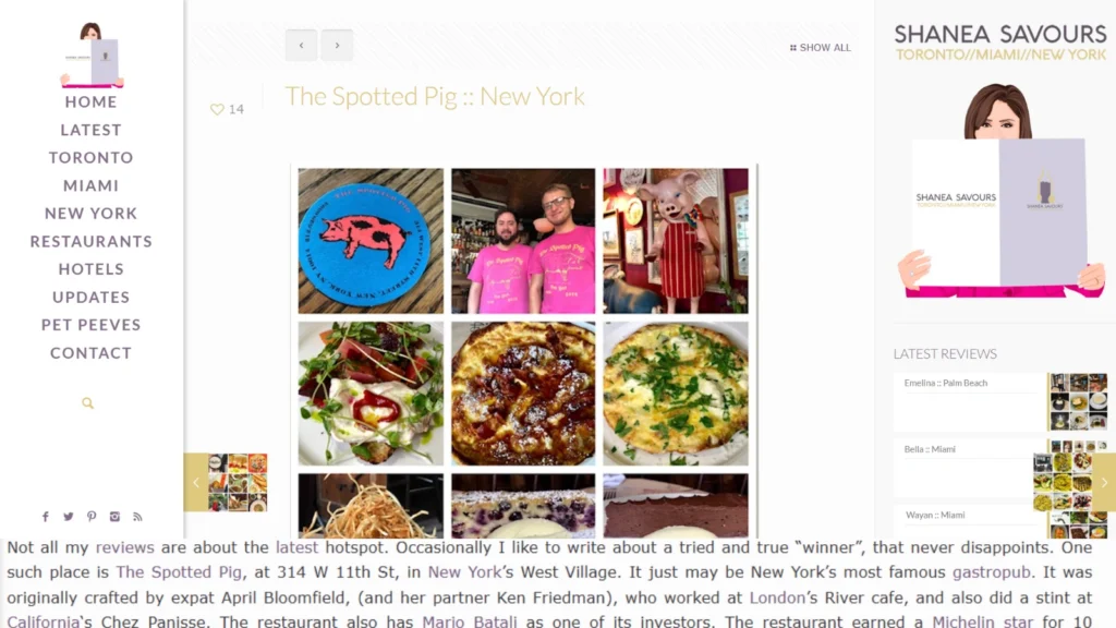
16. The Spotted Pig — Gastropub | New York, NY
Website: thespottedpig.com
Why It Works: The gastropub personality comes through clearly in every design choice. A handwritten-feel typography and warm tonal palette communicate authenticity and approachability, exactly what a beloved neighborhood spot should convey.
The menu design is simple and readable. Categories are clearly separated, items are easy to scan, and there are no animations creating load delays. Functionality first, always.
All essential information lives in the footer — address, phone, hours — organized cleanly without clutter. It's not flashy, but it works because it's exactly where returning visitors expect to find it.
Key Feature to Steal: Consider custom or handwritten-style typography to give your website a sense of authenticity and warmth. Just make sure legibility isn't sacrificed in the process.
Best For: Gastropubs, craft beer spots, neighborhood bars that take their food seriously.
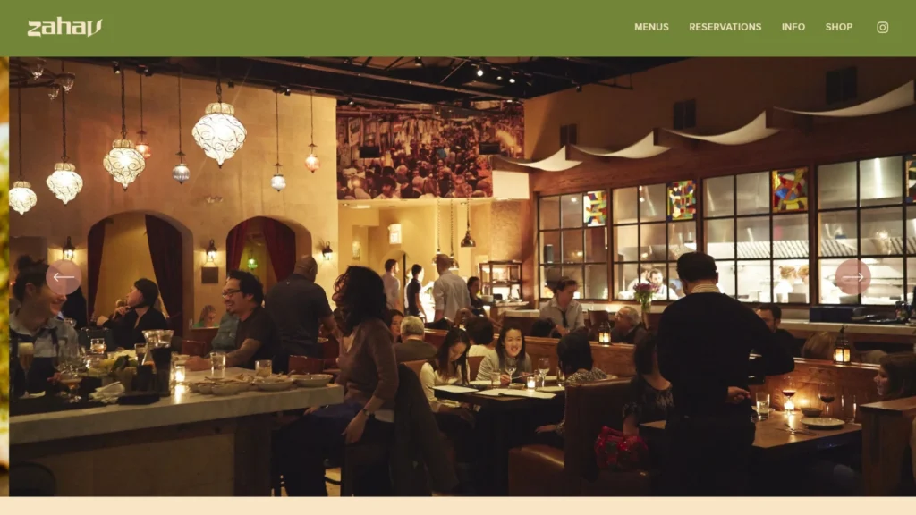
17. Zahav — Israeli Fine Dining | Philadelphia, PA
Website: zahavrestaurant.com
Why It Works: The storytelling here is exceptional. The chef's background and the restaurant's origin are told with genuine warmth and specificity. People don't just eat food — they eat stories. Zahav understands this better than almost anyone.
The photography feels personal rather than staged. Authentic moments from the kitchen and dining room feel documented rather than produced, which builds a different and more durable kind of trust with the reader.
Gift cards and the restaurant's cookbook are purchasable directly from the website — additional revenue streams integrated cleanly into the design without feeling like an afterthought.
Key Feature to Steal: Invest real effort into your About page. Tell the story of how your restaurant came to exist, who the chef is, and what drives the menu. That content creates emotional connection and meaningfully increases time on page.
Best For: Chef-driven restaurants, James Beard Award winners, restaurants with a compelling origin story or mission.
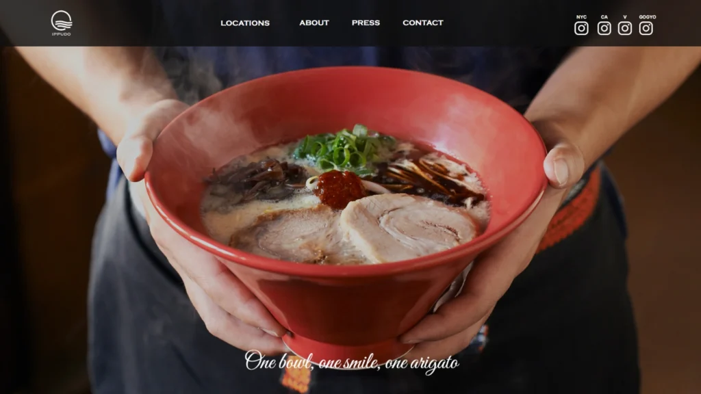
18. Ippudo — Ramen | US & International
Website: ippudony.com
Why It Works: The Japanese aesthetic comes through in clean lines, deliberate whitespace, and restrained photography. The design feels like an extension of the culinary philosophy rather than a separate marketing exercise.
Menu categorization is excellent — different ramen styles are clearly separated with descriptions that make the decision-making process genuinely easier. Good menu UX reduces ordering anxiety and increases overall satisfaction.
Each location has its own dedicated page with unique content — specific address, hours, and photography. This is local SEO best practice executed well at scale.
Key Feature to Steal: Build individual location pages with unique, specific content for each one. Generic location pages hurt both user experience and local search rankings. Give each location its own identity.
Best For: Ramen shops, Japanese restaurants, Asian dining concepts with multiple locations.
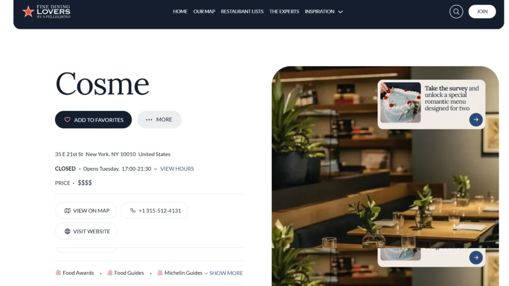
19. Cosme — Modern Mexican | New York, NY
Website: cosmenyc.com
Why It Works: The photography is ethereal and artistic — this website feels closer to a gallery than a restaurant site. Premium positioning is established within seconds, before the visitor has read a single menu item.
The homepage is radically minimal — logo, one stunning image, navigation. No noise. This level of restraint signals extreme confidence in the brand and the product.
Private dining and events are clearly featured and easy to find from the main navigation. These are high-margin revenue opportunities, and making them discoverable on the website is a smart business decision.
Key Feature to Steal: Give your private dining, events, and catering offerings their own prominent position in your navigation. These are high-value services that often go undiscovered because they're buried in the footer.
Best For: Modern fine dining, tasting menu restaurants, high-profile urban concepts where the reservation itself carries status.
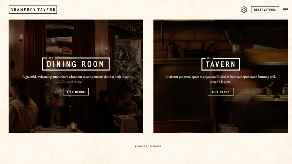
20. Gramercy Tavern — New American | New York, NY
Website: gramercytavern.com
Why It Works: The photography is warm and genuinely welcoming. It makes fine dining feel approachable rather than intimidating. That's a difficult balance to achieve, and the design manages it consistently throughout.
Seasonal content is prominently featured. Menu updates and evolving offerings are reflected on the website, which is both a great user experience and a meaningful freshness signal for search engines.
Community involvement and charitable work are featured on the website because today's diners actively seek out brands whose values align with their own. This kind of content builds loyalty, not just awareness.
Key Feature to Steal: Add a blog or 'What's New' section where you share seasonal specials, events, menu changes, and kitchen stories. Fresh, relevant content is one of the most reliable and underused SEO strategies available to restaurants.
Best For: American fine dining, farm-to-table concepts, restaurants with a strong community identity and neighborhood roots.
Restaurant Website Mistakes That Are Costing You Customers
You've seen what great looks like. Now let's talk about what to avoid. These are the most common mistakes I see on restaurant websites — any one of them can be the difference between a booking and a bounce.
Mistake #1 — The PDF Menu: Uploading your menu as a PDF is one of the most damaging things you can do for mobile usability. Visitors have to pinch, zoom, and scroll sideways just to read it. Use an HTML menu that renders cleanly on any device. Your search indexing will also improve as a direct benefit.
Mistake #2 — Heavy Animations and Slow Load Times: Elaborate intro animations and uncompressed images destroy page speed. Core Web Vitals are a confirmed Google ranking factor. A slow website ranks lower, frustrates visitors, and loses customers. Keep it lean.
Mistake #3 — Outdated Hours and Menu Information: If your website says you're closed on Mondays but you now open on Mondays, every person who reads that and stays home is a customer you've lost. Outdated information isn't just a bad look — it's direct revenue loss.
Mistake #4 — No Mobile Optimization: Over 72% of restaurant searches happen on mobile devices. A desktop-only approach in 2026 is not a strategy. Mobile-first design is non-negotiable.
Mistake #5 — Buried Contact Information: Your address and phone number should be visible without scrolling. Not just in the footer. If a visitor has to hunt for your location, most of them won't bother. Put it in the header or hero section.
Mistake #6 — Generic Stock Photography: Stock photos immediately make a restaurant feel inauthentic. They signal a lack of care about the brand. Invest in a real photoshoot, or shoot your own with good natural light. Either option beats a library image of a plate that doesn't exist in your kitchen.
Mistake #7 — No Clear Call-to-Action: Your homepage needs one clear, dominant call-to-action. 'Reserve a Table,' 'Order Online,' or 'View the Menu.' If visitors can't figure out what to do next, they'll do nothing. Bold, prominent, and above the fold. Every single time.
Restaurant Website Must-Have Features Checklist (2026)
Use this to audit your own website right now. If something is missing, it belongs near the top of your priority list.
Design & Branding
- Consistent brand colors throughout the site — two to three at most
- Professional food photography — zero stock images
- Mobile-responsive design tested on multiple devices
- Typography that reflects your restaurant's personality
- Ambiance and interior photos alongside food photography
Functionality & Speed
- Page load time under 3 seconds — test with Google PageSpeed Insights
- SSL certificate — your URL should start with https://
- HTML menu — not a PDF
- Clickable phone number for mobile users
- Embedded Google Map on your contact or location page
Essential Information
- Address and hours visible above the fold or in a sticky header
- Online reservation integration — OpenTable, Resy, or similar
- Online ordering link — your own system or a delivery platform
- Social media links
- Contact form or email address
SEO & Local Search
- Google Business Profile claimed, verified, and regularly updated
- Local keywords naturally incorporated in page titles, headings, and body copy
- Individual pages for each location if you have multiple
- Schema markup — LocalBusiness and Restaurant types
- Regular content updates — seasonal menus, events, blog posts
How Much Does a Restaurant Website Cost in 2026?
This is one of the most common questions from restaurant owners considering a redesign. Cost depends almost entirely on the approach you choose. Here's a straightforward breakdown:
| Approach | Estimated Cost | Best For |
| DIY — Squarespace or Wix | $20–$50/month | Very small cafes, tight budgets |
| Freelance Designer | $1,500–$5,000 one-time | Growing restaurants, mid-range budgets |
| Agency / Full Service | $5,000–$20,000+ | Fine dining, multi-location chains |
PRO TIP: If you can only invest in one thing, make it photography. A $500–$1,000 professional food photoshoot can deliver better ROI than a $10,000 website redesign. Great photos make even a simple website feel premium.
Best Restaurant Website Builders for 2026
1. Squarespace — Best for Design-Forward Restaurants
Squarespace templates are visually polished out of the box, and their restaurant-specific features — menu management, reservation integration, and online ordering — are built in. It's the most beginner-friendly option that doesn't sacrifice quality. Cost: $23–$65 per month.
2. Wix — Best for Flexibility and Customization
Wix offers the most restaurant website design freedom of any drag-and-drop builder. The Wix Restaurants system handles menu management, online ordering, and table reservations in one place. More flexibility means more decisions, but also more potential. Cost: $17–$159 per month.
3. WordPress + Elementor — Best for SEO and Long-Term Scalability
If SEO is a priority and you want full ownership and control of your website, WordPress is the superior long-term choice. The learning curve is steeper, but the results — in terms of both design freedom and search performance — are consistently better. Cost: $10–$30 per month for hosting and domain.
4. Toast — Best for Restaurant-Specific Operations
Toast is built exclusively for restaurants, which means POS integration, online ordering, loyalty programs, and website management all live in one ecosystem. For growing restaurant operations that want everything in one place, it's worth the investment.
Why Your Restaurant Website Deserves Your Full Attention Right Now
Think about what actually happens when someone searches 'best Italian restaurant near me' and your listing comes up. They click your website. If it loads slowly, the menu is buried, the address requires scrolling three times, and nothing works right on their phone — they close the tab and book a table somewhere else. That customer may never come back.
Now flip it. Your website loads in two seconds. The menu is one click away. Your address and hours are at the top of the page. There's a 'Reserve a Table' button in the hero section that actually works on mobile. You've already won that customer before they've tasted a single dish. The decision is essentially made before they even walk in the door.
The 20 examples in this guide aren't meant to be copied — they're meant to be studied. Every restaurant has its own identity, its own personality, its own story. Your website's job is to communicate that story clearly and make it as easy as possible for the right people to walk through your door. Get that right, and your website becomes the most reliable front-of-house team member you have — working 24 hours a day, 7 days a week, never calling in sick.
About the author


Popular Posts
CBD Website Design: Complete Guide for CBD Brands & Ecommerce Stores
June 11, 2026- 17 Min Read

Is Framer the Same as Figma? Real Difference, Use Cases, and Best Workflow
June 3, 2026- 14 Min Read
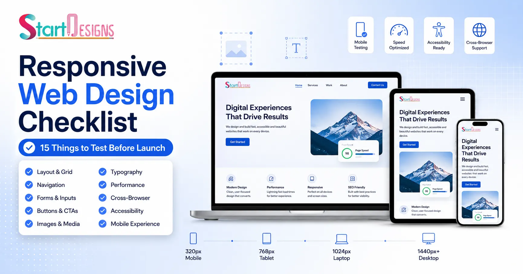
Responsive Web Design Checklist: 15 Things to Test Before Launch
May 23, 2026- 14 Min Read