- About us
-
Services
- Back
- Development Services
-

-
-
-
- Designing Services
-
-
-
-
- Marketing Services
-
-
-
-
- Cloud Engineering Services
-
-
-
- ERP
-
-
-
- CRM
-
-
-
- Artificial Intelligence
-

-
-
-
- MVP
-
- Industry
- Portfolio
- Career
- Contact us
-
 info[at]startdesigns.com


Introduction: Why Responsive Web Design Still Matters in 2026
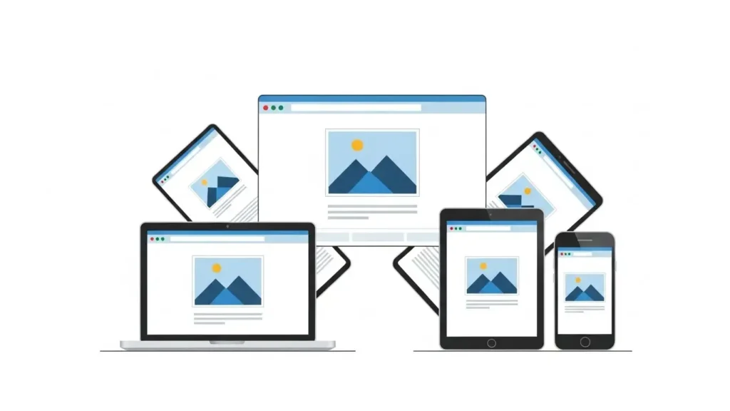
In today’s multi-device world, responsive web design (RWD) is no longer optional — it’s essential. Users switch seamlessly between desktops, tablets, smartphones, foldable screens, and even smart TVs. Websites must adapt dynamically to all these devices to provide a smooth, consistent, and accessible experience.
Originally popularized by Ethan Marcotte, RWD has become the standard in web design. Google now favors mobile-friendly and responsive sites, making RWD critical for UX, SEO, and conversions.
By following this guide, designers, developers, and business owners will learn how to build modern, SEO-optimized, fully responsive websites that deliver exceptional experiences across devices.
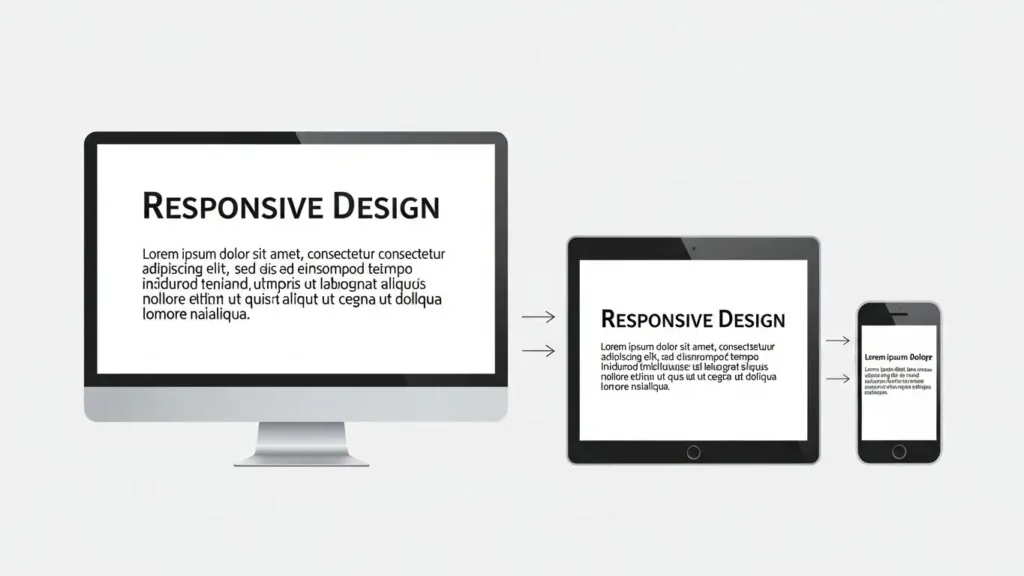
What Is Responsive Web Design?
Responsive Web Design is a design philosophy where layouts, images, and text automatically adjust to the screen size, resolution, and orientation of the device.
Key characteristics:
- Single URL for all devices — no separate mobile site
- Fluid grids and layouts using relative units
- Flexible images and media
- Media queries to trigger layout adjustments
Unlike static or fixed designs, responsive websites adapt intelligently, delivering the best possible experience for any device.
Why Responsive Design Is Crucial in 2026
Responsive design today isn’t just about fitting content on screens — it’s about performance, accessibility, SEO, and conversions.
Key benefits:
- Seamless User Experience: Users can switch devices without broken layouts or inconsistent experiences.
- Google Ranking Boost: Core Web Vitals and mobile-first indexing favor responsive, fast-loading sites.
- Better Conversions: Readable, usable, and visually optimized layouts increase engagement and sales.
- Accessibility Compliance: RWD supports reflow (WCAG 1.4.10) and ensures content is usable for all users.
- Future-Proof Design: With foldables, large monitors, and new devices emerging, responsive design ensures your site stays relevant.
Design Quote Today!
Core Principles of Responsive Web Design
Responsive design relies on three foundational pillars: fluid grids, flexible media, and media queries.
1. Fluid Grid Systems
Fluid grids replace fixed-width layouts with proportional widths, allowing content to scale based on screen size.
- Traditional grids: pixel-based, rigid, break on different devices
- Fluid grids: use
%,fr,rem, or modern CSS Grid & Flexbox
Example (Modern CSS Grid):
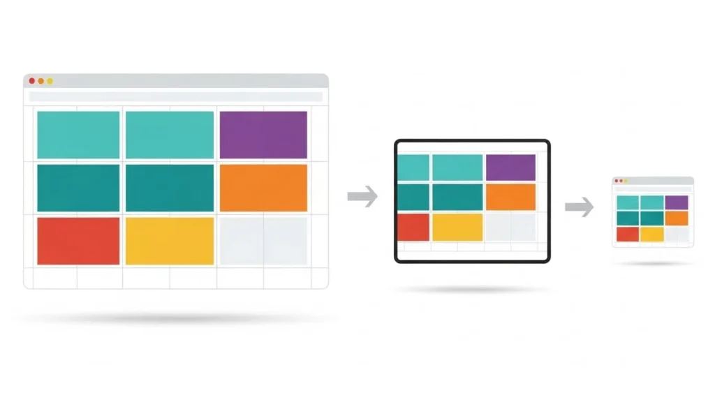
Benefits:
- Layout adapts naturally to any screen
- Fewer breakpoints needed
- Simplifies maintenance
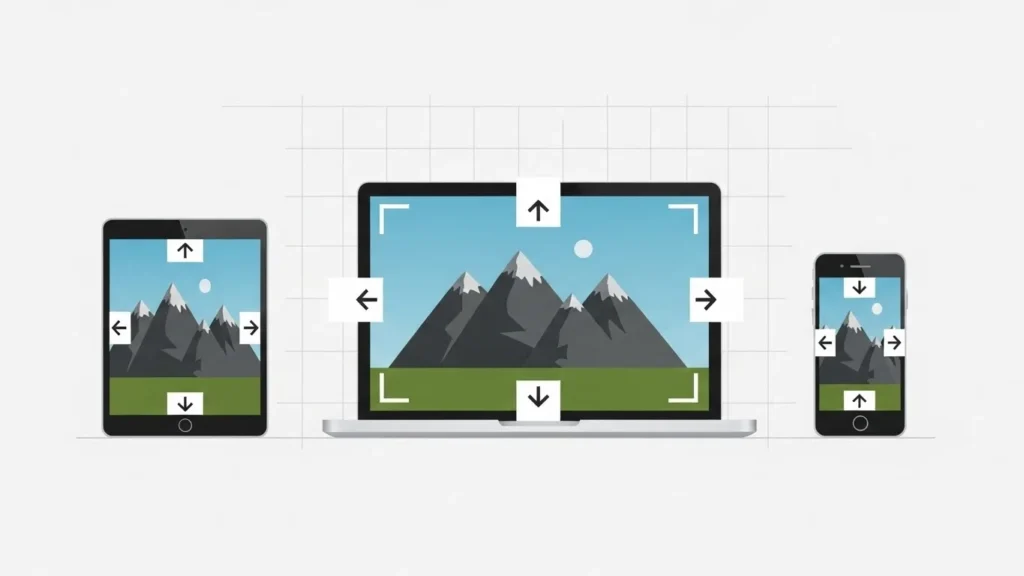
2. Flexible Media (Images, Videos, SVGs)
Images and videos must scale with their container:
Advanced techniques:
srcsetandsizesattributes for responsive images- AVIF/WebP formats for faster load times
- SVGs for logos/icons to scale without losing quality
- Aspect ratio boxes for videos and embeds
3. Media Queries
Media queries adjust layout based on screen or container size.
Modern approach:
- Mobile-first: start small, scale up
- Content-based breakpoints: break layouts where content needs adjustment, not just device width
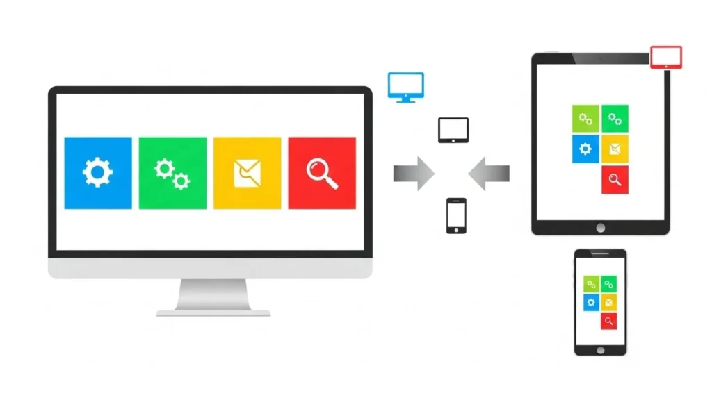
Benefits:
- Optimized readability and flow
- Reduces unnecessary horizontal scrolling
- Enhances accessibility
Modern Responsive Techniques
To truly beat competitors, include advanced methods:
1. Responsive Typography
- Fluid font scaling:
clamp(),vw,rem
- Text adapts naturally across devices
- Enhances readability and accessibility
2. CSS Grid & Flexbox Hybrids
- Grid for layout
- Flexbox for components like cards, navbars
- Combine for complex responsive patterns
3. Container Queries
- Layout adapts based on parent container size
- Ideal for modular, reusable components
4. Responsive Images with srcset
- The browser selects the optimal size
- Reduces bandwidth, improves load speed
- Priority+ menus
- Scrollable tabs
- Smart hamburger overlays
- Navigation follows thumb movement for touch devices
Best Practices for Responsive Design
- Mobile-first, content-first
- Minimum 3 breakpoints: mobile → tablet → desktop
- Prioritize essential content on small screens
- Minimalistic layout for faster comprehension
- Touch-friendly buttons and interactive elements
- Test across real devices and browsers (BrowserStack, Responsively App, Chrome DevTools)
- Maintain contrast, line height, and readability
- Optimize images, lazy-load, compress CSS/JS
Performance & SEO Considerations
Responsive design + speed = higher ranking:
- Optimize Core Web Vitals: LCP, CLS, FID
- Lazy loading images & videos
- Compress and minify CSS & JS
- Use preconnect and preload for critical assets
- Monitor mobile UX signals (bounce rate, scroll depth)
Common Responsive Mistakes to Avoid
❌ Copy desktop layout to mobile
❌ Fixed-width elements
❌ Ignoring tablet or large screens
❌ Not testing slow connections
❌ Non-scalable images or media
❌ Forgetting accessibility guidelines
Real-World Case Study: Improving Conversions with RWD
Scenario: E-commerce website redesign
Problem: Desktop-focused site, poor mobile UX → high bounce
Solution:
- Mobile-first redesign
- Fluid grids & responsive images
- Touch-friendly buttons and simplified navigation
Results:
- Bounce rate decreased by 28%
- Average session duration increased by 35%
- Mobile conversions +22%
Tools to Test & Improve Responsive Design
- Chrome DevTools Device Mode
- Responsively App (multi-device preview)
- BrowserStack / LambdaTest
- Lighthouse Mobile Performance Audit
- GTMetrix Mobile Test
The Takeaway
Responsive Web Design in 2026 is about letting the device do the work. By combining:
- Fluid grids
- Flexible media
- Media queries
- Modern CSS & typography
- Touch-friendly navigation
- Optimized performance
…you can create websites that look great, load fast, and rank higher on Google, while providing an accessible and delightful experience for users across all devices.
FAQs
What is responsive web design?
A method where layouts, images, and text automatically adjust to any screen.
Why is RWD important in 2026?
Users browse on multiple devices, including foldables, TVs, and cars. Google prioritizes mobile-first, responsive sites.
Core principles of responsive design?
Fluid grids, flexible media, media queries.
Modern CSS approaches for responsiveness?
CSS Grid + Flexbox + Container Queries + Fluid Typography.
Does responsive design affect SEO?
Yes. Faster, accessible, mobile-friendly sites rank higher and improve Core Web Vitals.
About the author


Popular Posts

20 Best Ecommerce Website Design Examples for Inspiration (2026)
March 6, 2026- 9 Min Read

Astrology Website Design and Development: Examples & Best Practices
March 3, 2026- 6 Min Read
