- About us
-
Services
- Back
- Development Services
-

-
-
-
- Designing Services
-
-
-
-
- Marketing Services
-
-
-
-
- Cloud Engineering Services
-
-
-
- ERP
-
-
-
- CRM
-
-
-
- Artificial Intelligence
-

-
-
-
- MVP
-
- Industry
- Portfolio
- Career
- Contact us
-
 info[at]startdesigns.com


Cheap responsive web design usually does not fail at first glance. It fails when a real customer opens the site on mobile, waits for the page to load, tries to tap the menu, fills out a form, or compares your business with a cleaner competitor website.
A low quote can look attractive before the project starts. The real cost appears later when the website loads slowly, breaks on smaller screens, hides important calls to action, blocks search engines from understanding the page, or needs another redesign within a few months.
The problem is not always low pricing. The real problem is paying for a website that only looks responsive but does not work properly across speed, usability, SEO, ownership, support, and conversions.
This guide is for business owners comparing low-cost website quotes and trying to avoid a rebuild, not for developers looking for coding tutorials. It explains where cheap responsive web design usually fails and gives you 15 practical checks before hiring a web design company.
The Cheap Responsive Website Trap: Low Quote, High Repair Cost
A cheap website often starts with a simple promise: fast delivery, low price, and a mobile-friendly layout. That sounds useful, especially for small businesses trying to control costs. But a layout that shrinks on mobile can still fail if the menu is hard to tap, the form feels painful, or the quote button disappears below long sections.
A business website has to guide visitors clearly. The menu should work without frustration. Text should stay readable. Buttons should be easy to tap. Images should not slow the page down. Forms should work on small screens. Search engines should be able to crawl the important content. The website owner should also know who controls the files, logins, domain, CMS, and post-launch support.
Many cheap website projects skip these less visible parts. The final design may look acceptable on a desktop preview, but real users do not browse your business only from a desktop screen. They may open your site from an iPhone, Android phone, tablet, office laptop, or slow mobile connection.
A cheap website becomes expensive when it needs repair before it starts producing leads. You may pay again for layout fixes, speed cleanup, SEO corrections, form testing, plugin replacement, content restructuring, or a complete rebuild.
That is why the quote should not be judged only by the price. A low quote is not the problem. A vague quote is. Judge the offer by what the web design company actually checks, builds, tests, and supports.
Cheap vs Affordable Responsive Web Design: The Difference Most Businesses Miss
A cheap website project and an affordable responsive website project are not the same thing.
A low-price build usually means the provider cuts important steps to reduce the upfront price. Affordable design means the project stays cost-conscious while still following a proper process.
A business does not need to overpay for unnecessary features, but it should not accept a website that ignores mobile usability, page speed, SEO foundations, forms, ownership, or support.
| Cheap Responsive Web Design | Affordable Responsive Web Design |
|---|---|
| Starts with the lowest possible quote | Starts with clear project scope |
| Uses a ready layout without enough planning | Plans layout around business goals |
| Says “mobile-friendly” without testing details | Tests key screens and device sizes |
| Adds SEO later, if at all | Builds headings, metadata, links, and crawlability into the project |
| Uses heavy themes or plugins without cleanup | Controls theme weight, images, and scripts |
| Focuses on appearance first | Balances design, speed, usability, and lead flow |
| Gives unclear access or ownership | Defines CMS, domain, hosting, and admin access |
| Ends after launch | Includes support, fixes, or maintenance options |
If your goal is a cost-conscious website without cutting the parts that matter, compare cheap work with properly planned affordable responsive web design services before choosing a vendor.
The right web design company should explain what is included, what is not included, how the mobile layout will be tested, how speed will be handled, how SEO basics will be protected, and what support you will get after launch.
Where Cheap Responsive Web Design Usually Breaks First
Low-budget responsive websites do not always fail in obvious ways. The homepage may look fine in a screenshot. The real problems appear when visitors start using the site.
The Layout Looks Responsive Until Users Start Scrolling
A cheap design may resize on mobile, but that does not mean the mobile experience is good.
Common issues include large empty spaces, crowded text, oversized images, broken sections, awkward content stacking, and buttons that move too far down the page. Sometimes the most important message disappears below the fold because the designer only checked the desktop version.
A responsive layout should consider how users read on small screens. The section order, text size, image dimensions, white space, and CTA placement all matter.
The Menu Works on Desktop but Slows Down Mobile Decisions
Mobile navigation is one of the first places cheap web design fails.
A menu may look simple on desktop but become confusing on mobile. The hamburger icon may be hard to notice. The dropdown may cover the screen. Important pages may sit too deep inside the menu. The contact or quote button may disappear.
Mobile users decide quickly. If they cannot find your services, pricing direction, portfolio, contact form, or phone number, they may leave before your page has a chance to convert.
The Site Loads, But Too Slowly to Convert
A website can technically load and still feel slow.
Cheap website projects often use heavy themes, too many plugins, uncompressed images, unused scripts, large sliders, and page builders that add unnecessary code. These choices affect mobile users more because many visitors browse on weaker connections.
Speed is not only a technical metric. It affects trust, leads, and user patience. If the site feels slow, users may never reach the form, product page, or quote button.
The Design Looks Good, But the Lead Path Is Weak
Some cheap websites focus only on how the page looks. They do not plan how a visitor moves from interest to action.
A strong responsive website should answer:
- What should the visitor notice first?
- Where should they tap next?
- Can they contact the business without zooming or searching?
- Does the form feel easy on mobile?
- Are trust signals visible before the user loses interest?
If the website looks modern but does not guide users toward action, it is not doing its job.
SEO Gets Added Later Instead of Built Into the Website
Poorly planned web design often treats SEO like a final plugin or an afterthought. That is risky.
Search-friendly design starts during planning. The page needs a clear heading structure, crawlable content, clean internal links, optimized title tags, useful meta descriptions, image alt text, schema where relevant, and proper redirects if the project is a redesign.
A business website should not look good while hiding important content from users or search engines. If SEO matters to your business, ask whether the company builds an SEO-friendly responsive website design from the beginning instead of trying to patch it later.
The 15-Point Hiring Audit Before You Pay a Web Design Company
Before hiring a web design company, use this audit to judge the quality of the quote, process, and delivery. A good company should be able to answer these checks clearly.
Mobile Experience Checks
1. Ask Which Screen Sizes They Actually Test
Do not accept “it will be responsive” as a complete answer.
Ask which screen sizes they test. At minimum, the website should be checked across common mobile, tablet, and desktop widths such as 360px, 390px, 768px, 1024px, and larger desktop screens. Real-device testing is also valuable because browser resizing does not always reveal mobile issues.
Ask direct questions:
- Which mobile screens will you test?
- Will you test on iPhone and Android?
- Will you check both portrait and tablet views?
- Will you test the final website after content is added?
A responsive theme is not the same as a tested responsive website.
2. Check Whether Buttons Are Easy to Tap
Mobile users do not click with a mouse. They tap with a thumb.
Buttons should have enough space around them. Important links should not sit too close together. The main CTA should be visible without making the screen feel crowded. The header should not take too much vertical space. If a sticky button is used, it should help the user, not block the content.
Check the design on a real phone. Try tapping the menu, service links, phone number, quote button, and form fields. If you make mistakes while tapping, your visitors may also struggle.
3. Review How Content Stacks on Small Screens
Responsive design is not only about shrinking sections. The content should stack in the right order.
For example, if a desktop section has text on the left and an image on the right, the mobile version should still make sense when those blocks stack vertically. A cheap build may create awkward sequences where images appear before context, CTAs drop too low, or important trust points disappear after long scrolling.
Ask to review mobile layouts before approval. Do not approve only desktop mockups.
Speed and Technical Checks
4. Ask How They Control Theme Bloat
Many cheap websites use multipurpose themes packed with features the business never uses. These themes may load extra scripts, styles, sliders, animations, icons, and page builder files on every page.
Ask the web design company how they control theme bloat.
They should be able to explain:
- Which theme or framework they use
- How many plugins they expect to install
- Whether unused features will be disabled
- How they manage CSS and JavaScript
- Whether the site will depend heavily on a page builder
A website that is easy for the designer to build may not be easy for users to load.
5. Confirm Image Optimization Before Upload
Images often create major speed problems.
A cheap project may upload oversized images directly from stock websites, design files, or phone cameras. These files can make mobile pages heavy and slow. Proper image handling includes resizing, compression, modern formats such as WebP, responsive image sizes, descriptive filenames, and lazy loading where appropriate.
Ask if image optimization is included before upload. If the answer is vague, assume it may not be handled properly.
6. Ask If They Test Core Web Vitals
Core Web Vitals are not just technical buzzwords. They help identify real user experience issues such as slow loading, layout shifting, and delayed interaction.
You do not need every score to be perfect, but your web design company should understand mobile performance. Ask whether they check Largest Contentful Paint, Cumulative Layout Shift, Interaction to Next Paint, image weight, unused scripts, and mobile loading behavior.
A cheap website may pass a visual review but still perform poorly when users open it on real devices.
SEO Foundation Checks
7. Check If Headings Are Planned Before Design
A website should have a clear content structure before design starts.
Cheap design often begins with sections and visuals first, then content is forced into the layout later. This can create weak headings, repeated messages, unclear page hierarchy, and poor topical relevance.
For important service pages, headings should guide both users and search engines. The H1 should clearly describe the page. H2 sections should cover the service, process, benefits, proof, FAQs, and conversion points. Blog articles should also use headings that match search intent instead of random keyword placement.
Ask whether the company plans headings and page sections before design approval.
8. Ask What Happens to Existing URLs During Redesign
If you already have a website, redesign work can affect existing rankings.
Cheap redesigns often ignore old URLs, internal links, page titles, metadata, and redirects. That can create broken pages, 404 errors, missing content, and ranking drops.
Before hiring anyone for a redesign, ask:
- Will old URLs be reviewed?
- Will redirects be added where needed?
- Will existing ranking pages be protected?
- Will metadata and headings be migrated or improved?
- Will internal links be checked after launch?
A redesign should improve the website without damaging what already works.
9. Confirm Metadata, Schema, and Internal Links
Basic SEO setup should not be left unclear.
Ask whether the project includes title tags, meta descriptions, image alt text, structured headings, schema markup where useful, sitemap updates, internal links, and Search Console setup.
For service businesses, internal links are especially important. A blog article, portfolio page, FAQ, and service page should support each other naturally. Random pages without thoughtful links often fail to build topical strength.
Conversion Checks
10. Check If the CTA Appears Before Users Lose Interest
A responsive website should make the next step obvious.
The CTA does not need to be aggressive, but it should be easy to find. On mobile, users should not have to scroll through half the page before understanding how to request a quote, call the business, view services, or book a consultation.
Ask how the company plans CTA placement across mobile and desktop. A strong layout usually includes a clear hero CTA, a relevant middle-page CTA, and a final CTA near the end. For some businesses, a sticky call or quote button may also help.
11. Test the Contact Form Like a Real Customer
Forms are common failure points in cheap web design.
A form may look fine but feel difficult on mobile. Fields may be too small. The keyboard type may not match the input. Required fields may be unclear. The submit button may sit too low. The success message may not appear. Leads may fail to reach the business email.
Before launch, test the form on a real phone. Submit a test inquiry. Check the email notification. Confirm the thank-you message. Make sure tracking works if you use analytics or ads.
A form that does not work properly can waste the entire website.
12. Ask How Trust Signals Appear on Mobile
Visitors need reasons to trust you before they contact you.
Cheap websites often hide trust signals too low on mobile or skip them completely. A business website should show useful proof such as testimonials, portfolio examples, years of experience, process details, guarantees, certifications, client logos, case studies, or platform expertise.
The mobile version should not bury all trust-building content under long image sections. A visitor should see enough proof before being asked to take action.
Ownership and Support Checks
13. Confirm You Own the Website Access and Files
Ownership should be clear before payment.
Ask who controls the domain, hosting, CMS login, theme license, plugins, design files, source files, and admin access. Cheap offers sometimes hide ownership details, making it difficult to move the website, update pages, or hire another developer later.
You should know exactly what access you receive after launch.
A professional company should not make you feel trapped. The website should serve your business, not lock your business into unclear control.
14. Ask What Support Is Included After Launch
Websites often need small fixes after going live.
A button may need adjustment. A form notification may need testing. A mobile spacing issue may appear after final content is uploaded. A plugin may need configuration. A speed issue may need review.
Ask whether the quote includes post-launch support. Even 15 to 30 days of bug support can make a major difference. If support is not included, ask for the maintenance cost before starting.
A low-cost build becomes stressful when the provider disappears after launch.
15. Compare the Quote With Long-Term Business Cost
The cheapest quote is not always the lowest cost.
If the website needs repair, redesign, speed cleanup, SEO correction, or migration later, the business pays twice. If leads drop because the mobile form is hard to use, the hidden cost becomes even bigger.
Compare every quote against long-term value:
- Will the website support future pages?
- Will it be easy to update?
- Will it load quickly enough for mobile users?
- Will it protect SEO basics?
- Will it help visitors contact the business?
- Will you own and control the website properly?
A cheap website becomes expensive when you have to rebuild it before it starts producing leads.
Quote Red Flags: What Cheap Web Design Proposals Often Hide
A web design quote should explain more than price and delivery time. If a proposal is too vague, the missing details often become problems later.
Watch for these red flags:
- “Responsive website included” but no testing process
- No mention of mobile screen sizes
- No mobile mockup or preview stage
- No sitemap or page structure planning
- No page speed process
- No image optimization details
- No SEO migration plan for redesigns
- No explanation of CMS access
- No ownership details
- No revision limit clarity
- No form testing process
- No analytics or Search Console setup
- No post-launch support
- No backup or security discussion
- No clear responsibility for content
If the quote only says “responsive website included” but does not explain devices, testing, speed, forms, SEO, and support, the word responsive is too vague to trust.
A serious web design company should be able to explain the work behind the word “responsive.”
Cheap Website or Smart Budget Website? Use This Decision Scorecard
Use this scorecard before approving a quote.
| Check | Weak Quote | Strong Quote |
|---|---|---|
| Mobile testing | “Responsive theme included” | Screen sizes and real-device testing mentioned |
| Speed | Not discussed | Image, theme, script, and plugin optimization included |
| SEO | “Basic SEO” with no detail | Metadata, headings, redirects, schema, and links explained |
| Ownership | Unclear access | Domain, hosting, CMS, and admin access defined |
| Support | Ends at launch | Post-launch fixes or maintenance options included |
| Conversion | Focuses only on design look | CTA, forms, trust signals, and lead flow planned |
| Redesign safety | Old pages ignored | URL review and redirects included |
| Content | Placeholder text used | Page message and structure planned |
| Security | Not mentioned | SSL, updates, backups, and form protection discussed |
| Future growth | Hard to edit | CMS flexibility and future pages considered |
A smart budget website does not need every advanced feature on day one. But it should have a stable foundation. It should be usable on mobile, easy to understand, clean enough for search engines, simple to update, and structured to help the business receive inquiries.
When Cheap Responsive Web Design Costs More Than Professional Work
Cheap responsive web design can cost more in several ways.
The first cost is repair. After launch, you may discover mobile bugs, slow pages, broken forms, missing metadata, poor spacing, or confusing navigation. Fixing these issues takes time and money.
The second cost is lost traffic. If a redesign ignores old URLs, internal links, headings, or metadata, search performance may suffer. Recovery can take longer than the original project.
The third cost is wasted advertising. If you send paid traffic to a slow or confusing website, users may leave before contacting you. The ad budget gets spent, but the website does not support conversion.
The fourth cost is weak trust. A website with poor mobile behavior can make a real business look careless. Visitors may not complain. They simply leave and choose another company.
The fifth cost is dependency. If you do not own your access, files, or CMS, even small updates can become difficult.
Professional work costs more upfront because it includes planning, testing, cleanup, structure, and accountability. If your website needs to support leads, SEO, ads, or long-term brand trust, working with a professional responsive web design company can protect you from paying twice.
Final Checklist Before Hiring a Web Design Company
Before you hire a web design company, do not judge the offer only by the price. Use the quote to understand the process.
Confirm these points before payment:
- Mobile breakpoints will be tested
- Real devices or practical screen sizes will be reviewed
- Buttons and menus will be easy to use on small screens
- Images will be compressed and properly sized
- The theme or builder will not overload the site
- Core Web Vitals will be considered
- Headings will be planned before design approval
- Metadata and internal links will be included
- Old URLs will be protected during redesign
- Contact forms will be tested on mobile
- CTA placement will be planned for user action
- Trust signals will appear clearly on mobile
- CMS, hosting, domain, and admin access will be clear
- Post-launch support will be defined
- The quote will explain scope, revisions, and ownership
Cheap responsive web design fails when it skips the work users do not see immediately: mobile testing, speed cleanup, SEO structure, conversion planning, ownership clarity, and support.
Do not choose a web design company only because the quote is low. Choose the team that can explain how your website will stay readable, fast, crawlable, and lead-focused after launch.
FAQs About Cheap Responsive Web Design
Is cheap responsive web design always bad?
No. A lower-cost website is not always bad. The problem starts when the low price removes important work such as mobile testing, speed optimization, SEO setup, form testing, ownership clarity, and post-launch support. Affordable can be good when the scope is clear and the build process is responsible.
What is the biggest risk of cheap responsive web design?
The biggest risk is paying for a website that looks acceptable but does not perform in real use. Common issues include slow mobile speed, broken layouts, weak CTAs, poor forms, unclear navigation, and missing SEO foundations.
How can I tell if a web design quote is too cheap?
A quote may be too cheap if it does not mention mobile testing, page speed, SEO basics, content structure, redirects, CMS access, form testing, revisions, or support. A low price without a clear process usually creates hidden costs later.
What should a responsive web design company test before launch?
A responsive web design company should test mobile layouts, tablet views, desktop views, menus, buttons, forms, image scaling, page speed, browser behavior, internal links, metadata, redirects, and lead notifications before launch.
Should I choose a cheap website if I only need a simple business site?
A simple business website can still be planned properly. You may not need advanced features, but you still need readable mobile pages, fast loading, working forms, clear CTAs, basic SEO setup, and access ownership. Simple should not mean careless.
What is the difference between cheap and affordable responsive web design?
Cheap responsive web design usually cuts essential work to reduce price. Affordable responsive web design controls cost through clear scope while still covering mobile usability, speed, SEO basics, testing, ownership, and support.
About the author
Popular Posts
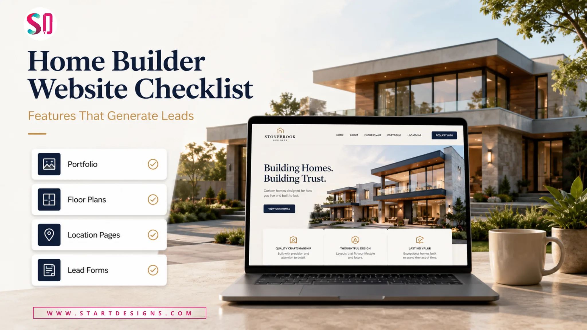
Home Builder Website Design Checklist: 25 Features That Generate Leads
June 17, 2026- 12 Min Read

CBD Website Design: Complete Guide for CBD Brands & Ecommerce Stores
June 11, 2026- 17 Min Read

Is Framer the Same as Figma? Real Difference, Use Cases, and Best Workflow
June 3, 2026- 14 Min Read