- About us
-
Services
- Back
- Development Services
-

-
-
-
- Designing Services
-
-
-
-
- Marketing Services
-
-
-
-
- Cloud Engineering Services
-
-
-
- ERP
-
-
-
- CRM
-
-
-
- Artificial Intelligence
-

-
-
-
- MVP
-
- Industry
- Portfolio
- Career
- Contact us
-
 info[at]startdesigns.com


A home builder website should do more than show beautiful homes. It should help buyers find the right location, compare floor plans, understand your process, trust your team, and take the next step without confusion.
For most buyers, your website is the first real sales conversation they have with your brand. Before they call, they want to know what you build, where you build, how your homes look, what the process feels like, and whether your company is worth trusting with a major life decision.
This checklist will help you plan a home builder website that works as a clear, helpful, and lead-focused experience not just an online brochure.
Before you start planning your own layout, you can also explore our complete list of best home builder website design examples to see how leading builders present their homes, communities, and brand online.
What Makes a Home Builder Website Different?
A home builder website is not like a regular service website. The decision is bigger, more emotional, and usually takes longer. Buyers are not just comparing prices; they are imagining where their family will live, how the home will feel, and whether your team can deliver what you promise.
That is why your website needs to answer a few important questions quickly:
- What type of homes do you build?
- Which cities or communities do you serve?
- Can buyers see real projects?
- Are floor plans available?
- What is your building process?
- Do past clients trust you?
- How can someone schedule a consultation or tour?
The best builder websites make this journey feel simple. They remove doubt, guide buyers to the right information, and make the next step obvious.
Quick Home Builder Website Design Checklist
Here is a simple checklist you can use before designing or redesigning your website.
| Priority | Website Element | Purpose |
|---|---|---|
| High | Clear hero section | Tells buyers what you build and where |
| High | Strong call-to-action (CTA) | Moves visitors toward consultation or tour |
| High | Location/community pages | Helps local buyers find relevant homes |
| High | Portfolio/gallery | Shows real work and design quality |
| High | Floor plans | Helps buyers compare layouts |
| High | Short inquiry form | Improves lead conversion |
| Medium | Testimonials | Builds confidence |
| Medium | Process page | Explains what happens after inquiry |
| Medium | Financing guidance | Reduces cost-related hesitation |
| Medium | FAQ section | Answers common buyer questions |
| Medium | Blog/resources | Captures research-stage visitors |
| Low | Awards/media logos | Adds authority and proof |
A good website should never make buyers dig for basic information. The easier the journey feels, the more likely they are to contact your team.
Home Builder Website Lead-Readiness Scorecard
Before investing in a redesign, score your current website. This will help you understand whether it only looks good or is actually ready to generate qualified home buyer leads.
| Area | Question | Score |
|---|---|---|
| Hero Section | Does the first screen clearly explain what you build and where? | /10 |
| Portfolio | Are real projects shown with useful details? | /10 |
| Floor Plans | Can buyers compare size, rooms, layout, and options? | /10 |
| Trust Signals | Are reviews, awards, warranty, and experience visible? | /10 |
| Lead Capture | Are forms, CTAs, and phone buttons easy to find? | /10 |
| Local SEO | Do you have useful city or community pages? | /10 |
| Mobile UX | Is the website easy to use on mobile? | /10 |
| Speed | Do images and pages load quickly? | /10 |
| Content | Do you answer buyer questions through blogs and FAQs? | /10 |
| Tracking | Are calls, forms, bookings, and downloads tracked? | /10 |
Score Meaning
80–100: Strong and lead-ready.
60–79: Good foundation, but needs optimization.
40–59: Looks decent, but may be missing key conversion elements.
Below 40: A strategic redesign is likely needed.
This scorecard is useful because many builder websites look attractive but still fail to turn visitors into inquiries.
Recommended Home Builder Website Architecture
A strong website needs a clear structure. Buyers should be able to move from inspiration to action without getting lost.
Recommended structure:
Homepage
→ Communities / Locations
→ Available Homes
→ Floor Plans
→ Portfolio
→ Building Process
→ Testimonials
→ Blog / Resources
→ Contact / Consultation
This structure works because it follows how buyers usually think. First, they want to know who you are. Then they check location, design quality, floor plans, trust signals, and finally the next step.
Match Your Website Content to the Buyer Journey
Not every visitor is ready to book a consultation immediately. Some are just exploring. Some are comparing builders. Some are ready to talk. Your website should support each stage.
| Buyer Stage | What the Buyer Needs | Website Content to Show |
|---|---|---|
| Awareness | Inspiration and first impression | Portfolio, home style guides, project photos |
| Research | Location, cost, process, options | Community pages, FAQs, financing info |
| Comparison | Reason to choose your company | Testimonials, awards, warranty, case studies |
| Decision | Clear next step | Consultation form, phone CTA, tour booking |
This is where many websites lose leads. They show nice images, but they do not guide the buyer through the decision process.
Must-Have Pages for a Home Builder Website
Homepage
Your homepage should quickly explain your brand, locations, home styles, and main call-to-action.
Include:
- Strong hero image or video
- Clear headline
- Service area or location
- Featured homes or communities
- Portfolio preview
- Reviews or trust badges
- CTA to schedule a consultation
The homepage should not try to say everything. It should guide visitors to the right next page.
Communities or Locations Page
Location matters a lot in home buying. If you build in multiple cities, neighborhoods, or communities, make those areas easy to find.
Include:
- Community list
- Map
- Available homes
- Nearby amenities
- Local project photos
- Short location-specific copy
- CTA to view homes or book a tour
Avoid thin location pages. Each page should feel useful, not copied.
Floor Plans Page
Floor plans help buyers compare options before contacting your team.
Include:
- Plan name
- Square footage
- Bedrooms and bathrooms
- Garage details
- Plan image
- Customization options
- Downloadable PDF
- CTA to request pricing
If there are many plans, add filters for size, rooms, floors, garage, and price range.
Portfolio Page
A portfolio should prove your quality, not just display random images.
For each project, add:
- Project location
- Home style
- Size or key specifications
- Special features
- Short project note
- CTA to discuss a similar home
Real images with context build much more trust than stock-style galleries.
Building Process Page
Many buyers feel nervous because they do not know what happens after the first call. A process page makes the journey feel easier.
Show steps like:
- Consultation
- Location or lot discussion
- Design planning
- Budget estimate
- Permits
- Construction
- Walkthrough
- Handover
- Warranty support
Keep the language simple. Buyers should feel guided, not overwhelmed.
Testimonials Page
Testimonials should show more than “great service.” Strong reviews mention communication, timeline, quality, problem-solving, and the final experience.
Better testimonial format:
- Client name or initials
- Location
- Home/project type
- Review
- Project photo if available
Place reviews near CTAs, especially on floor plan, community, and contact pages.
Contact or Consultation Page
This page should be simple and focused.
Include:
- Short form
- Phone number
- Office or model home address
- Service area
- Calendar booking option
- Clear message about what happens next
Recommended form fields:
| Field | Use |
|---|---|
| Name | Basic contact |
| Follow-up | |
| Phone | Sales call |
| Preferred location | Lead qualification |
| Timeline | Buyer intent |
| Project type | Better routing |
| Budget range | Optional |
| Message | Optional |
Do not make the first form too long. You can ask deeper questions later.
Lead-Generation Features That Actually Matter
A high-converting builder website does not need every fancy feature. It needs the right features placed at the right moments.
1. Clear Above-the-Fold CTA
The first screen should have a direct action button.
Good CTA examples:
- Schedule a Consultation
- View Available Homes
- Explore Floor Plans
- Book a Model Home Tour
- Request Floor Plan Pricing
Avoid weak CTAs like “Submit” or “Learn More” as the main button.
2. Location-Based Search
If buyers can search by city, community, zip code, or available homes, they will find relevant options faster. This is especially useful for builders serving multiple locations.
3. 3D Tours and Video Walkthroughs
Virtual tours help buyers experience a home before visiting. They are useful for out-of-state buyers, busy families, and people comparing multiple builders online.
4. Design Studio or Customization Section
Show buyers how they can personalize their home.
You can include:
- Kitchen finishes
- Bathroom styles
- Flooring options
- Exterior styles
- Cabinet colors
- Lighting upgrades
This helps buyers imagine the final home more clearly.
5. Sticky Mobile CTA
Many visitors will browse from mobile. A sticky button for “Call Now,” “Book Tour,” or “Schedule Consultation” can reduce friction and improve inquiries.
6. CRM-Connected Forms
A form should not just send an email. It should connect to your sales process so leads are captured, assigned, followed up, and measured properly.
7. Conversion Tracking
Track actions like:
- Form submissions
- Phone clicks
- Brochure downloads
- Floor plan requests
- Tour bookings
- Chat inquiries
Without tracking, traffic numbers do not tell the full story.
CTA Strategy by Page Type
Every page should have a CTA that matches the visitor’s intent.
| Page Type | Best CTA |
|---|---|
| Homepage | Schedule a Consultation |
| Floor Plan Page | Request Floor Plan Pricing |
| Community Page | Book a Model Home Tour |
| Portfolio Page | See Similar Home Designs |
| Blog Post | Discuss Your Project |
| FAQ Page | Talk to a Home Building Expert |
| Contact Page | Start Your Home Project |
A person reading a blog may not be ready for pricing. A person viewing floor plans probably is. Match the CTA to the moment.
Trust Signals That Help Buyers Choose You
Trust is one of the biggest conversion factors for home builders. Buyers want proof that your team can deliver.
Useful trust signals include:
- Years in business
- Number of homes built
- Industry awards
- Builder association memberships
- Certifications
- Google reviews
- Client testimonials
- Warranty information
- Real team photos
- Real project photos
- Financing partners
- Media mentions
Do not hide trust signals only on the About page. Place them near important decision points like CTAs, forms, and floor plan pages.
SEO Checklist for Home Builder Websites
A builder website should be designed for people first, but search engines still need clear signals.
Use this checklist:
- Create city or community-specific pages
- Use descriptive title tags and meta descriptions
- Add useful internal links between pages
- Optimize project image alt text
- Compress large images
- Add FAQ sections where helpful
- Publish buyer-focused blog content
- Keep URLs short and clear
- Add local business schema where appropriate
- Improve mobile speed
- Connect blog posts to service and consultation pages
- Keep Google Business Profile details consistent
Good local page examples:
- Custom Home Builder in Austin
- New Home Builder in Dallas
- Luxury Home Builder in Scottsdale
- Build on Your Lot in Tampa
Each page should include local context, project examples, and a clear CTA.
Visual Content Checklist
Home building is visual. Buyers want to see the quality before they talk to your team.
Add visuals like:
- Exterior home photos
- Interior photos
- Kitchen and bathroom details
- Model home videos
- Drone footage
- Floor plan images
- 3D walkthroughs
- Community maps
- Design studio photos
- Construction progress images
- Client testimonial videos
Use real project visuals whenever possible. Stock images may look polished, but they do not build the same level of confidence.
Example-Inspired Takeaways from Top Builder Websites
You do not need to copy another builder’s website, but you can learn from how leading brands guide visitors.
| Brand | What Builders Can Learn |
|---|---|
| Toll Brothers | Strong hero visuals and property search help visitors start quickly |
| Tri Pointe Homes | Simple navigation keeps the journey clean |
| Ashton Woods | Awards and trust signals create early confidence |
| Meritage Homes | Buyer-focused content helps different customer types |
| Lennar | Location-based search makes home discovery easier |
For more visual inspiration, explore our complete list of home builder website design examples.
Common Home Builder Website Mistakes to Avoid
1. Beautiful Design Without a Clear Path
A website can look premium and still fail if visitors do not know what to do next. Every major page should guide users toward a relevant action.
2. Hidden Service Areas
If buyers cannot quickly see where you build, they may leave. Mention locations clearly and create helpful local pages.
3. Long Contact Forms
Asking too much too early can reduce inquiries. Keep the first step simple.
4. Weak Project Details
Photos are important, but buyers also want context. Add location, style, size, and unique features where possible.
5. Poor Mobile Experience
If floor plans, forms, galleries, or menus are difficult on mobile, serious buyers may drop off.
6. Slow Image Loading
Large images can make pages feel heavy. Compress visuals and test speed before launch.
7. No Local SEO Plan
Without city and community pages, your website may miss high-intent local searches.
8. No Tracking
If calls, forms, and bookings are not tracked, it becomes hard to know which pages are actually generating leads.
Final Home Builder Website Launch Checklist
Before launching your website, check these points:
- Homepage clearly says what you build and where
- CTA is visible above the fold
- Service areas are easy to find
- Portfolio uses real projects
- Floor plans are easy to compare
- Contact form is short
- Phone number is clickable
- Reviews are placed near CTAs
- FAQ section answers buyer objections
- Images are compressed
- Mobile layout is tested
- Local pages are optimized
- Internal links are added
- Analytics and conversion tracking are working
- CRM integration is tested
A successful home builder website should make buyers feel informed, confident, and ready to take the next step.
Need a High-Converting Home Builder Website?
Your website should not just look good. It should help buyers understand your work, trust your process, explore homes easily, and contact your team with confidence.
At Start Designs, we create modern, mobile-friendly, and conversion-focused websites for home builders, real estate brands, and construction businesses.
If you are planning a new website or redesigning an old one, our team can help you build a website that showcases your work and turns visitors into qualified leads.
Discuss Your Home Builder Web Design Project — Free Consultation!
FAQs
What should a home builder website include?
A home builder website should include a clear homepage, location pages, portfolio, floor plans, testimonials, building process, FAQ section, contact form, and strong calls-to-action.
What is the most important page on a home builder website?
The homepage is important, but floor plan, community, portfolio, and contact pages often play a bigger role in converting serious buyers.
How can a home builder website generate more leads?
It can generate more leads through clear CTAs, short inquiry forms, location pages, floor plan filters, testimonials, fast mobile experience, CRM integration, and conversion tracking.
Are 3D tours useful for home builder websites?
Yes. 3D tours help buyers explore homes before visiting in person. They are especially useful for out-of-state buyers and people comparing multiple builders.
How do I make a home builder website SEO-friendly?
Create location-specific pages, optimize images, improve site speed, add internal links, publish helpful blog content, use clear page titles, and keep local business details consistent.
Where can I see the best home builder website design examples?
You can explore our curated list of best home builder websites to see how leading builders use visuals, navigation, search features, floor plans, and trust signals effectively.
About the author

Popular Posts

CBD Website Design: Complete Guide for CBD Brands & Ecommerce Stores
June 11, 2026- 17 Min Read

Is Framer the Same as Figma? Real Difference, Use Cases, and Best Workflow
June 3, 2026- 14 Min Read
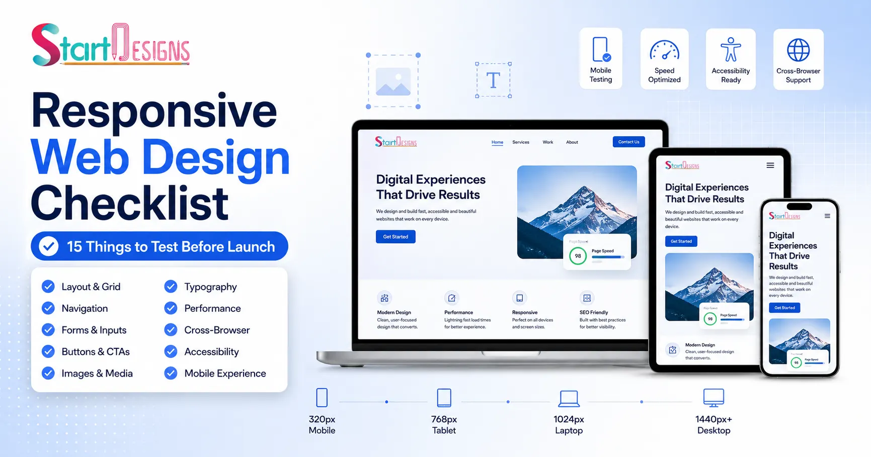
Responsive Web Design Checklist: 15 Things to Test Before Launch
May 23, 2026- 14 Min Read