- About us
-
Services
- Back
- Development Services
-

-
-
-
- Designing Services
-
-
-
-
- Marketing Services
-
-
-
-
- Cloud Engineering Services
-
-
-
- ERP
-
-
-
- CRM
-
-
-
- Artificial Intelligence
-

-
-
-
- MVP
-
- Industry
- Portfolio
- Career
- Contact us
-
 info[at]startdesigns.com


Your website is more than a digital presence—it’s a lead-generating, credibility-building, decision-making engine for B2B buyers. In 2026, businesses need websites that combine professional design, AI/SEO-optimized content, and intuitive UX to engage multiple stakeholders and convert them into clients.
See How We Craft High-Converting B2B Websites | Start Designs
At Start Designs, we specialize in designing B2B websites that build trust, engage professional audiences, and drive business growth. Watch this quick overview to see how our team combines strategic design, intuitive UX, and conversion-focused development to deliver websites that generate results for B2B companies.

Here’s a curated list of 15 B2B website designs for inspiration this year.
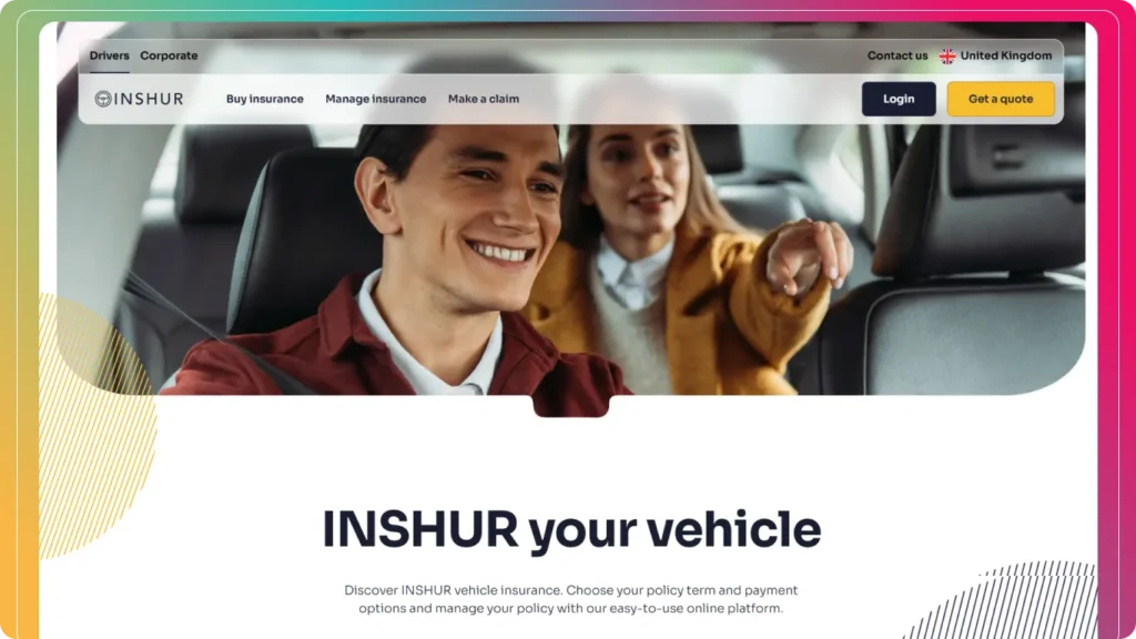
1. Inshur – Automotive Insurance Expertise Online
Inshur’s B2B website balances visual appeal with usability. Automotive-themed imagery reinforces the brand niche, while separate B2C and B2B sections make navigation effortless. Every element—from typography to color—enhances clarity and guides prospects toward action.
Takeaways:
- Clear segmentation for different audiences
- Cohesive branding across the site
- Optimized pathways for lead capture
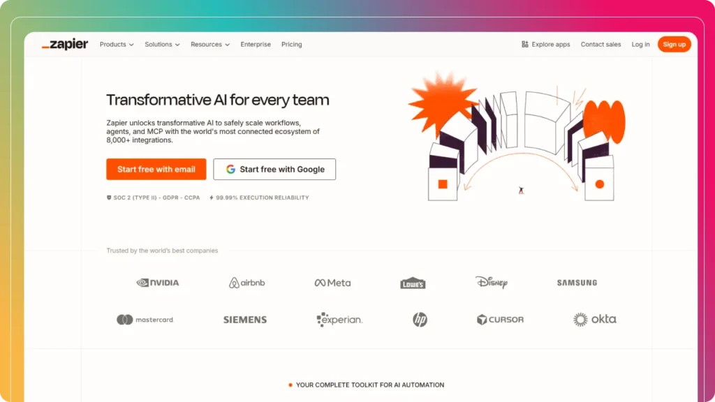
2. Zapier – Simplifying Complex Workflows
Zapier’s website makes complex software solutions intuitive. Product offerings are presented with hierarchies, visuals, and micro-interactions, helping new and advanced users alike.
Takeaways:
- User-friendly hierarchy
- Product demos and screenshots enhance understanding
- Visual storytelling improves engagement
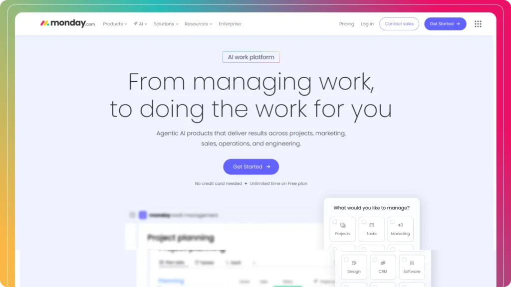
3. Monday.com – Personalized UX at Scale
Monday.com focuses on customized experiences. Dynamic product selectors, iconography, and mega menus ensure that visitors quickly understand how the platform meets their needs.
Takeaways:
- Personalized homepage experience
- Clear navigation for complex offerings
- Visual cues guide user journeys
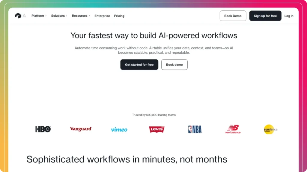
4. Airtable – Organizing Complexity with Clarity
Airtable’s B2B website excels at making complex database solutions simple and accessible. Its clean interface, interactive demos, and clear value proposition make it easy for teams to understand its features.
Takeaways:
- Interactive demos enhance comprehension
- Clear value proposition for multiple stakeholders
- Minimalist, distraction-free design
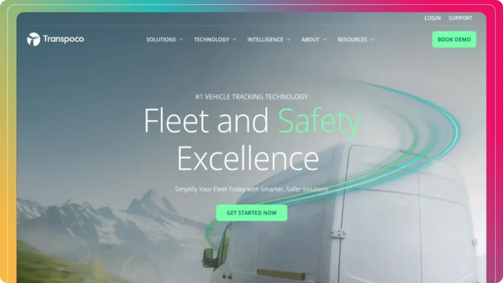
5. Transpoco – Premium Brand Presentation
Transpoco emphasizes a consistent, high-end visual identity. Every page reflects credibility through photography, typography, and subtle design cues.
Takeaways:
- Strong brand language
- High-quality visuals + typography
- Authority & trust reinforced throughout
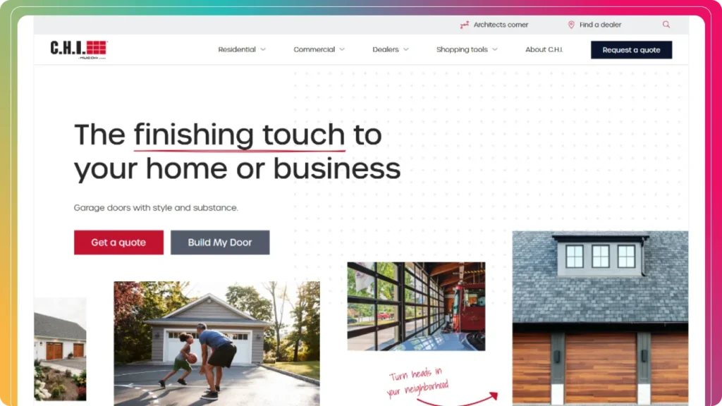
6. C.H.I Overhead Doors – Luxury Meets Functionality
C.H.I’s site showcases premium products elegantly. Layouts, photography, and subtle motion combine to create a sophisticated browsing experience while guiding buyers to conversion points.
Takeaways:
- Elegant, premium-focused design
- Interactive elements boost engagement
- Strategic color coding for navigation
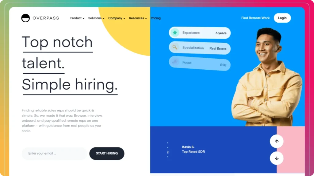
7. Overpass – Striking Visual Identity
Overpass uses bold imagery, color blocking, and micro animations for immediate impact. Whitespace ensures clarity, balancing creativity and readability.
Takeaways:
- Strong, memorable branding
- Balanced whitespace for focus
- Micro animations improve engagement
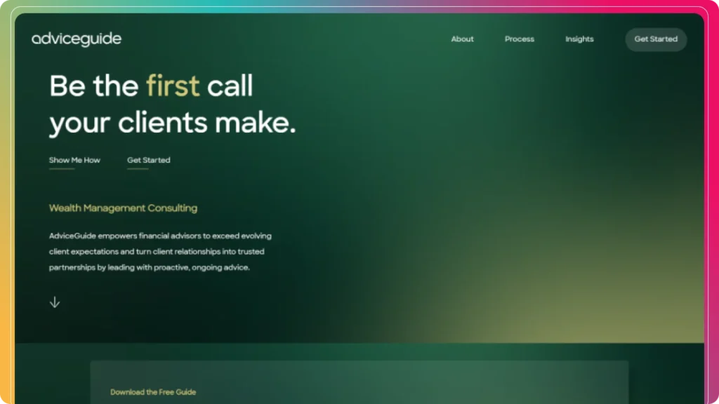
8. Advice Guide – Trust Through Design
Advice Guide’s website demonstrates the importance of trust in B2B design. Calming colors, intuitive layouts, and clear information flow establish credibility.
Takeaways:
- Design builds confidence and trust
- Logical content structure improves comprehension
- Strategic color choices enhance perception
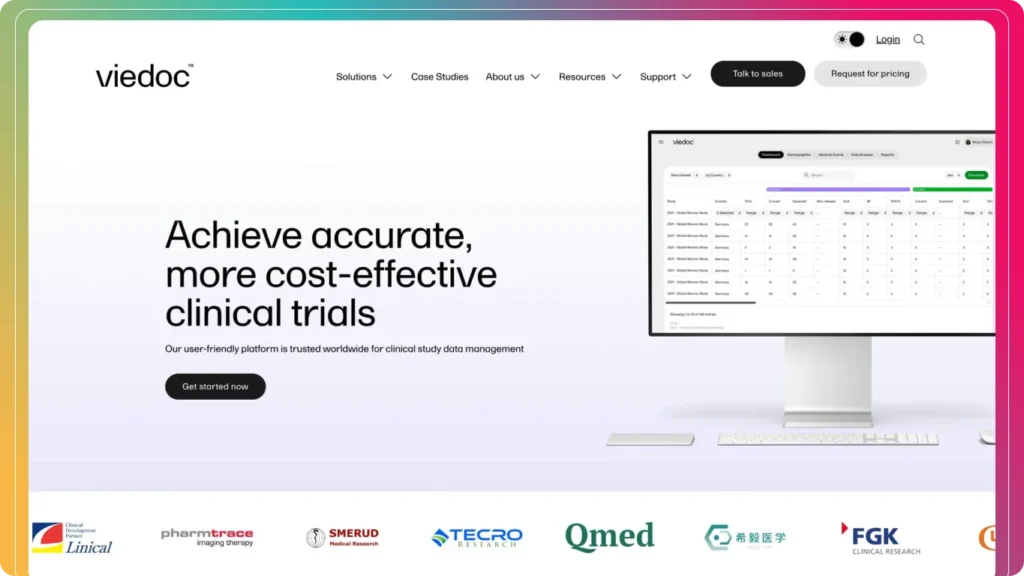
9. Viedoc – Minimalist Approach for Complex Data
Viedoc’s site simplifies complex clinical trial technology using whitespace, gradients, and UI visuals, making intricate processes easy to digest.
Takeaways:
- Minimalist design enhances usability
- Visual hierarchy supports comprehension
- Simple navigation for complex content
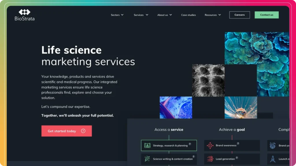
10. Biostrata – Showcasing Expertise Visually
Biostrata uses abstract visuals, subtle animations, and clear CTAs to highlight expertise and guide visitors through their offerings.
Takeaways:
- Visual storytelling reinforces authority
- Clear CTAs drive engagement
- Intuitive content hierarchy
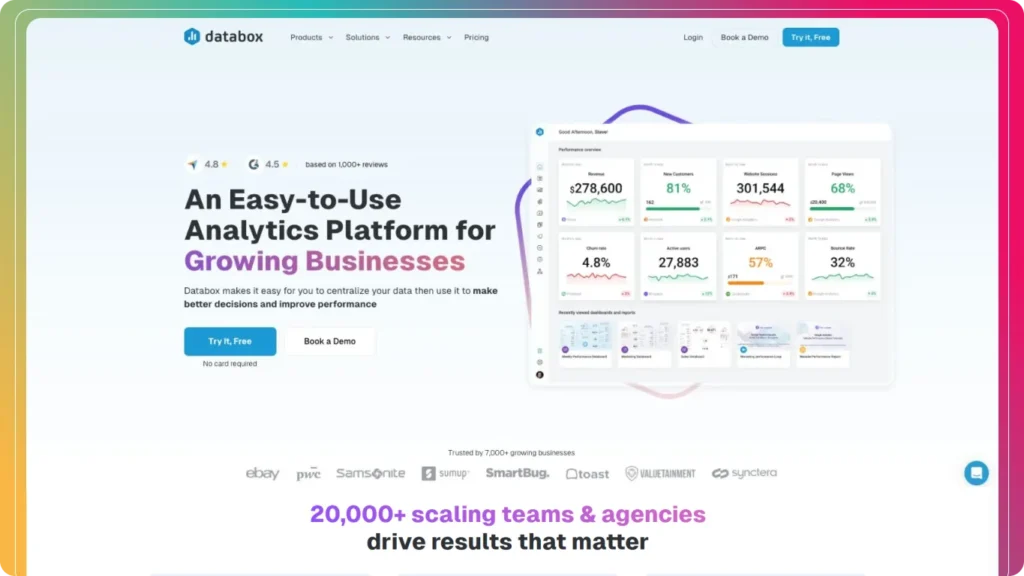
11. Databox – Clear Messaging & Social Proof
Databox balances creative design with clarity, using social proof and messaging to ensure users understand the platform while trusting the brand.
Takeaways:
- Immediate clarity in messaging
- Strategic social proof
- Sticky elements for comparison and conversion
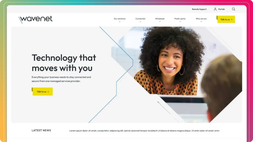
12. Wavenet – Modern Tech Presentation
Wavenet combines custom image masks and cohesive design patterns, guiding users with color cues and intuitive navigation.
Takeaways:
- Innovative visuals for tech audiences
- Cohesive design + intuitive navigation
- Conversion-focused layout
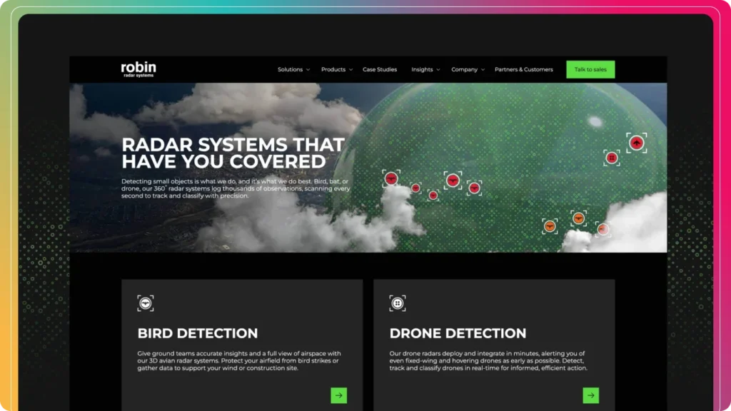
13. Robin Radar Systems – High-Tech Dark Theme
Robin Radar uses a dark-themed, visually strong design. The value proposition is clear immediately, and visuals support the brand message throughout.
Takeaways:
- Immediate value clarity
- Bold typography and visuals
- Effective CTA placement
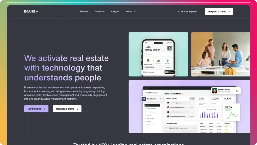
14. Equiem – Fundamentals Done Perfectly
Equiem emphasizes clarity, usability, and conversion paths. Videos, typography, and section backgrounds work together to ensure core messaging is prominent.
Takeaways:
- UX fundamentals prioritized
- Engaging visuals and clear copy
- Optimized for high-intent leads
15. HubSpot – Enterprise SaaS Excellence
HubSpot’s B2B website demonstrates enterprise-level UX, clear messaging, and lead funnel integration. The homepage communicates value immediately, with CTA placement designed for conversions.
Takeaways:
- Clear enterprise messaging
- Conversion-focused homepage
- Seamless multi-stakeholder navigation
Key Insights for 2026 B2B Websites
- Clarity & trust are everything – Immediate value proposition and credibility signals matter.
- Visual hierarchy and whitespace – Guide users through complex solutions effortlessly.
- Personalization & segmentation – Cater to multiple decision-makers.
- Conversion-focused design – CTAs, forms, demos, and lead magnets should be clear.
- SEO & AI optimized – Ensure content is discoverable and snippet-ready.
- Interactive, modern elements – Animations, micro-interactions, and demos increase engagement.
Conclusion
A successful B2B website in 2026 is more than just a digital brochure—it’s a lead generation engine, trust builder, and decision-making tool. The examples above highlight how top B2B companies combine clarity, visual hierarchy, personalization, and modern UX principles to engage multiple stakeholders and convert visitors into qualified leads.
By applying these insights—clean design, interactive elements, AI-optimized content, and conversion-focused CTAs—your B2B website can stand out in a competitive market, boost credibility, and generate measurable business results.
Start designing with purpose, optimize for results, and let your website become your most powerful B2B marketing asset.
Disclaimer:
All website screenshots and brand names featured in this article are the property of their respective owners. These visuals are used solely for educational and inspirational purposes, with no intention of copyright infringement.
About the author

Popular Posts