- About us
-
Services
- Back
- Development Services
-

-
-
-
- Designing Services
-
-
-
-
- Marketing Services
-
-
-
-
- Cloud Engineering Services
-
-
-
- ERP
-
-
-
- CRM
-
-
-
- Artificial Intelligence
-

-
-
-
- MVP
-
- Industry
- Portfolio
- Career
- Contact us
-
 info[at]startdesigns.com


Why Most Landing Pages Are Quietly Losing You Money
Here is a number worth sitting with: the average landing page converts at 2.35%. The top 10% of landing pages convert at over 11%. That is not a small gap. It is the difference between a business that struggles to grow and one that compounds.
What separates them is not the budget. A startup with a $500 design budget regularly outconverts Fortune 500 companies with six-figure web teams. What separates high-converting pages from forgettable ones is a handful of decisions made early: the headline, the CTA, the proof, and the friction.
I have spent the last several months going through 45 of the best landing page examples on the internet right now. These are not just pages that look good in a screenshot. These are pages with real conversion data behind them, real products people are buying, and real decisions you can learn from and apply today.
For every example in this guide, you will get three things. First, a breakdown of what they did well and the specific psychological reason it works. Second, an honest look at where the page falls short, because no page is perfect, and pretending otherwise is not useful. Third, one concrete thing you can take from that page and apply to yours this week.
Let’s start with what makes a good landing page before we get into the examples.
Key Takeaways
| Five things the best landing pages always get right 1. Every great landing page has exactly one goal. The moment you add a second CTA, you split your visitor’s attention, and your conversion rate drops. 2. Your headline has about five seconds to tell a visitor what you do, who it is for, and why they should care. If it can’t do that, rewrite it before you change anything else. 3. Social proof in 2026 is not a section at the bottom of the page. It is woven throughout. Logos, numbers, quotes, and ratings stacked together remove more objections than any one testimonial alone. 4. Every form field, every navigation link, and every pop-up is a small tax on your conversion rate. The best pages are ruthless about removing anything that does not push the visitor toward the one action they want. 5. More than 63% of web traffic is now on mobile. If your page was designed on a laptop and never tested on a phone, it is losing you conversions every single day. |
What Is a Landing Page?
A landing page is a standalone web page built around a single conversion goal. Someone clicks a link in an ad, an email, or a social post, and they land here. The page has one job: get that visitor to take one specific action, whether that is signing up for a free trial, making a purchase, downloading a resource, or booking a call.
The important distinction between a landing page and a homepage is focus. A homepage serves ten different audiences doing ten different things. A landing page serves one audience doing one thing. That focus is why dedicated landing pages consistently convert at two to three times the rate of homepages when used for campaigns.
| Landing Page | Homepage |
| Built for a single conversion goal | Built to serve multiple audiences |
| Navigation is usually removed | Full site navigation present |
| Matched to a specific ad or campaign | General brand overview |
| Every element points to one CTA | Multiple CTAs competing for attention |
| Measured by conversion rate | Measured by engagement and exploration |
What Makes a Landing Page Effective in 2026?
The fundamentals have not changed in twenty years. What has changed is how well your competitors execute them. Here is what the best landing pages are doing that most others are not.
Message Match
If your ad says ‘Free CRM Trial for Startups’ and your landing page headline says ‘Scale Your Business,’ you have already lost a significant chunk of the visitors who clicked. Message match means the headline on your landing page reflects the specific promise that brought the visitor there. This is one of the simplest changes you can make and one of the highest-leverage ones. I have seen teams double their conversion rates by fixing message match alone, without changing anything else on the page.
The Five-Second Test
Show your landing page to someone who has never seen your product. Give them five seconds, then close the browser. Ask them what the company does, who it is for, and what you are supposed to do on the page. If they cannot answer all three, your page has a clarity problem. Most conversion problems are actually clarity problems in disguise.
Social Proof as a System, Not a Section
A testimonial at the bottom of the page is table stakes. The best landing page examples in this guide treat social proof as architecture. They layer customer logos, total user counts, specific quotes with measurable outcomes, press mentions, and industry certifications throughout the page. Each layer addresses a different objection a visitor might have, and together they build the kind of trust that converts a skeptical visitor into a paying customer.
CTA Copy That Does Work
‘Submit’ converts poorly. ‘Get My Free Report’ converts significantly better. There is consistent evidence across thousands of A/B tests that first-person CTAs outperform second-person ones, specific CTAs outperform vague ones, and action-oriented CTAs outperform passive ones. ‘Start My Free Trial’ beats ‘Start Your Free Trial.’ ‘Show Me How It Works’ beats ‘Learn More.’ The words on your button are not decoration. They are a conversion lever.
Reducing Friction at Every Step
For lead generation pages, every form field you add reduces your conversion rate. The sweet spot for most industries is three fields or fewer. For e-commerce, every extra click between the product and the checkout is a place where people leave. Audit your page for friction by counting every step, every field, and every decision a visitor has to make before they convert. Then remove as many as you can.
The 45 Best Landing Page Examples of 2026
Each example below was chosen because it does something specific extremely well. These are not just pages that look nice. They are pages you can learn from, pages that are converting real traffic right now, and pages that contain at least one idea worth taking for yourself.
| Categories in this guide SaaS (B2C and B2B) | Ecommerce and DTC | Health and Wellness | Finance and FintechEducation and EdTech | Entertainment | Transportation | Food and Nutrition | Productivity |
SaaS Landing Pages
1. Notion | SaaS: Productivity
Notion is one of the hardest products to sell because it means different things to different people. It is a note-taking app. It is a wiki. It is a project manager. It is a database. That kind of flexibility is a nightmare to communicate on a landing page. The way Notion handles this is worth studying carefully.
Rather than trying to explain everything the product can do, their headline cuts to the core of it: ‘Your wiki, docs, and projects. Together.’ That is three distinct use cases in six words. The moment you read it, you understand both what the product does and why that combination is valuable. They do not ask you to imagine how you might use it. They tell you.
The second thing Notion does well is its dual CTA approach. ‘Get Notion free’ sits next to ‘Request a demo.’ This serves two completely different buyers in the same hero section. The individual user who wants to start right now clicks the first button. The team buyer who needs to justify the decision to a manager clicks the second. Most pages pick one and lose the other. Notion picks both.
The ’30 million people’ number in the hero section is doing more than showing scale. It is removing the ‘is this thing legitimate?’ question before the visitor can form it. When a tool has 30 million users, the burden of proof shifts. The visitor is no longer asking ‘should I trust this?’ They are asking, ‘Why am I not already using this?’
| Where it falls short: The headline ‘Connected workspace for wiki, docs, and projects’ is positioning language, not a benefit statement. A visitor who does not already know what Notion is will not immediately understand why they need it. Testing a more problem-aware headline like ‘Stop juggling five apps for the work that one tool can handle’ could improve conversions among cold traffic. |
| Take this home: Add a dual CTA to your next campaign page: one for your self-serve audience and one for buyers who need to involve other people in the decision. It takes ten minutes to implement and immediately captures two separate segments instead of forcing both through the same funnel. |
2. Loom | SaaS: Async Video Messaging
Async video messaging is one of those product categories that is genuinely difficult to explain in words. Loom’s landing page sidesteps this problem entirely by demonstrating the product in the first three seconds of the page load. There is an autoplaying demo video in the hero section. You see someone recording their screen, adding a voiceover, and sending it as a link. By the time you have finished reading the headline, you already understand what Loom does.
This is the ‘show, don’t tell’ principle taken to its logical conclusion. For any product that is faster to demonstrate than to describe, a real product demo in the hero section will almost always outperform a static screenshot or an illustration.
The headline ‘Say it with a Loom’ is also worth noting. It is short, it implies the product’s core value without listing features, and it frames the product as a communication verb rather than a software category. People do not want ‘async video messaging software.’ They want to say something clearly without scheduling a meeting.
The objection handling is quietly embedded in the subheadline. ‘No download needed. Free to use.’ These are the two questions that would stop most new users before they even try the product, and Loom addresses both of them before the visitor has scrolled an inch.
| Where it falls short: Most testimonials on the Loom page speak to how people feel about the product rather than what it actually produced for them. Sentiment-based testimonials like ‘my team loves this’ do not answer the question a skeptical visitor is actually asking, which is: what measurable thing got better after you started using it? Outcome-based testimonials with a specific before and after convert at a meaningfully higher rate than approval-based ones, and Loom has enough happy customers that finding a few with concrete results should not be difficult. |
| Take this home: Record a genuine 60-second screen capture of your product doing the one thing it does best and put it in your hero section. Do not produce a polished brand video. A real, slightly imperfect product demo is more credible than a cinematic trailer, and it converts better for software products. |
3. Linear | SaaS: Project Management
Linear is project management software for software development teams. That is a crowded category with well-funded incumbents. The way Linear carved out its position is worth examining because the landing page itself is a product decision, not a marketing decision.
The headline ‘Built for high-performance teams’ is deliberately exclusionary. It signals that this tool is not for everyone. It is not trying to replace Trello for your family holiday planning. It is for teams that care deeply about how fast their tools work and how well they are designed. This positioning immediately resonates with the exact buyer Linear wants and naturally repels everyone else. That is a good thing. The more specific your positioning, the higher your conversion rate will be with the audience you actually want.
The landing page itself is fast. Noticeably, measurably fast. That is not an accident. When you build a product that makes speed a core feature, your marketing page should feel fast too. Every time a visitor clicks something, and it responds instantly, Linear is silently demonstrating a core product promise.
The dark, precision-focused aesthetic also communicates something. It says: this tool takes software seriously. Teams that care about their craft recognize that aesthetic and respond to it. The design is a filter as much as it is a style choice.
| Where it falls short: Pricing is buried. Enterprise and team buyers want to ballpark cost before committing to a demo or a trial. Surfacing a ‘Plans from X per user per month’ line somewhere in the first scroll would help qualify serious buyers earlier and reduce the time wasted on users who will never pay. |
| Take this home: Narrow your headline until it describes one specific type of customer. Add the words ‘Built for’ or ‘Made for’ and name them. You will lose some visitors who were never going to buy anyway, and you will convert a much higher percentage of the visitors who are exactly who you want. |
4. Stripe | SaaS: Payments Infrastructure
Stripe’s homepage is not a typical landing page, but it functions like one for developer acquisition, and it is worth studying because of how precisely it is calibrated to a technical audience.
The first thing a developer sees when they land on the Stripe page is actual code. Not a screenshot of code. Not an illustration of code. Runnable, readable API code. This is a deliberate choice that communicates three things immediately: we understand how you think, our product is easy to integrate, and we are not going to waste your time with marketing fluff. For a technical buyer, showing real code in the hero section is more trust-building than any testimonial could be.
Stripe also publishes their uptime history, their security certifications, and their compliance frameworks directly on the page. In financial infrastructure, trust is not built through enthusiasm. It is built on evidence. Stripe’s page reads less like a sales page and more like a technical briefing, and that is exactly right for their buyer.
The logo bar deserves mention, too. When your customer list includes Amazon, Google, and Shopify, you do not need to write a long value proposition. Those logos are the value proposition. They tell every visitor who lands on the page: the biggest companies in the world trusted us. You can too.
| Where it falls short: The page is genuinely overwhelming for non-technical buyers, such as small business owners who want to accept payments without touching code. A simple landing page variant segmented for non-technical users would likely perform significantly better for that audience than the current page. |
| Take this home: If you are selling to developers or technical buyers, show real code, real dashboards, or real data in the hero section. Actual product output is more credible than any marketing asset you can create. |
5. Gusto | SaaS: HR and Payroll
Payroll software is not an exciting product category. Gusto’s landing page proves that it does not have to be an unexciting one, either. The way they have positioned their product says something important about how to market functional, unsexy tools.
The headline ‘Be the employer your team deserves’ is not about payroll software. It is about identity. It speaks to the business owner’s desire to be seen as a good employer. It taps into something emotional in a category where most competitors lead with compliance, accuracy, and time savings. Those things matter, but they do not make someone decide to buy. Wanting to be a good employer makes someone decide to buy.
Gusto uses video testimonials rather than written ones. This is a smart choice in a category where skepticism runs high. Written testimonials can be fabricated. Video testimonials from real business owners with real names and real company information are much harder to dismiss. Each testimonial Gusto chooses also addresses a different objection: cost, complexity, time investment, and trust. Together, they form a kind of objection matrix that covers most of what would stop a buyer.
The industry-specific landing pages Gusto runs deserve special mention. There is not one generic Gusto landing page. There are versions for restaurants, nonprofits, construction companies, and professional services. Each one speaks in the language of that industry and addresses that industry’s specific payroll problems. This level of specificity is expensive to build, but the conversion lift is usually worth it.
| Where it falls short: The pricing section does not surface the starter plan cost prominently enough. Small business owners evaluating payroll software are highly price-sensitive in the early stages of research. Showing ‘Plans from 40 dollars per month’ earlier in the page would reduce the drop-off that happens when price is the unknown. |
| Take this home: Build two or three audience-specific versions of your most important landing page. Keep the product the same. Change the headline, the testimonials, and the specific language to match each audience. Then measure which variant converts the audience you care most about. |
E-commerce and DTC Landing Pages
6. AG1 (Athletic Greens) | DTC: Health Supplement
AG1 costs around 79 dollars per month. For a powdered drink supplement, that is a significant price objection to overcome. The AG1 landing page is essentially one long, well-constructed argument for why that price is worth it, and it is worth examining because the persuasion architecture is genuinely sophisticated.
The page opens with authority stacking. A credentialed physician endorses the product first, followed by athlete testimonials, followed by everyday customer reviews. This three-tier sequence is intentional. The physician establishes scientific legitimacy. The athletes create aspirational appeal. The everyday customers create the ‘people like me’ identification that finally makes the purchase feel personal. Most pages pick one type of social proof. AG1 layers all three and sequences them for maximum impact.
Every benefit claim on the page has a number attached to it. ’75 vitamins, minerals, and whole-food sourced nutrients’ is specific. ‘Supports overall wellness’ is not. Specific claims are inherently more credible because they feel like facts rather than marketing language. When you write a benefit statement, ask yourself: Can I attach a number to this? If yes, do it.
The most effective copy decision on the page is the price reframe. AG1 does not present the price as 79 dollars per month. They present it as 2.63 dollars per day. That is the cost of a cup of coffee. This is not a trick. It is a genuine reframe of how to think about the value. When you change the time unit of a price, you change how the buyer processes it.
| Where it falls short: The page does not directly address the taste question, which is the most common objection for any food or drink product. Dedicating a section to flavor profile and texture, with specific testimonials about what AG1 tastes like, would reduce hesitancy among visitors who are interested but uncertain. |
| Take this home: Reframe your subscription price as a daily cost. If your product costs 60 dollars per month, that is two dollars per day. If it costs 300 dollars per year, that is 82 cents per day. Change the time unit and the price feels different. It takes five minutes to implement. |
7. Hims | DTC: Men’s Health
Hims sells treatments for hair loss and other health concerns that men historically do not discuss openly. The challenge their landing page faces is not just converting visitors. It is getting men to acknowledge they have a problem worth solving. That is a much harder task than standard e-commerce conversion.
The way Hims handles this is subtle and effective. The headline does not say ‘struggling with hair loss?’ That framing triggers defensiveness. Instead, it says ‘Thicker, fuller hair’ and moves directly to the outcome. The problem is implied rather than named. This is not avoidance. It is empathy. Hims understood that their buyer needed the solution presented without the social discomfort of having the problem announced back at them.
The quiz-based entry point is one of the smartest conversion mechanics on the page. Instead of asking visitors to buy something, Hims asks them to answer a few questions to find the right treatment. This creates what behavioral economists call commitment and consistency. Once someone has invested five minutes answering questions, they are far more likely to follow through on the recommendation at the end. They have skin in the game before they reach the checkout.
The subscription framing is also deliberate. Hims does not sell products. They sell a ‘healthcare routine.’ This repositions what could feel like spending money on vanity into investing in personal health. The language around the product is medical rather than cosmetic, which lowers the psychological barrier for men who would not typically describe themselves as interested in grooming products.
| Where it falls short: The page would benefit significantly from before and after results with documented timelines. For a product category where efficacy is the primary purchase driver, showing real customers at 8 weeks and 16 weeks with honest descriptions of their results would convert skeptical first-time buyers more effectively than any copy change. |
| Take this home: Replace your main CTA with a short quiz or assessment that helps visitors find the right option for their situation. Instead of ‘Buy Now,’ try ‘Find My Plan’ or ‘See What Works for Me.’ The quiz creates investment before the purchase decision and dramatically improves conversion among cold traffic. |
8. Warby Parker | E-commerce: Eyewear
Buying glasses online sounds like a bad idea. You cannot try them on. You do not know if they will suit your face. Warby Parker built their entire ecommerce model around solving that objection, and their landing page turns the biggest barrier to purchase into the headline offer.
The Home Try-On program puts five frames in your hands for five days at no cost. Notice the specificity in that offer. Not ‘try before you buy.’ Not ‘free returns.’ Five specific frames and five specific days. Specific offers are memorable in a way that vague ones are not. A visitor reading this page can immediately visualize what the experience will look like, which makes the decision easier.
The social proof on this page leans heavily on diversity, which is smart for an eyewear company. They show customers of different ages, face shapes, skin tones, and styles all wearing Warby Parker frames. The message is not ‘these glasses look good on models.’ It is ‘these glasses look good on people who look like you.’ That shift from aspirational to relatable is one of the more underused conversion moves in e-commerce.
The value proposition is also unusually transparent. Warby Parker explains early on the page why their glasses cost what they cost and how they compare to traditional eyewear retailers. This transparency is not just goodwill. It is a strategic objection removal. If a visitor is thinking, ‘these seem cheaper than my usual optician, is there a catch?’ the page addresses that question before they have to ask it.
| Where it falls short: The page does not give enough attention to the prescription lens experience, which is the source of most anxiety when buying glasses online. A clear, reassuring explainer covering how prescriptions work, what happens if the prescription is wrong, and how the process compares to an in-person optician visit would unlock a significant segment of hesitant buyers. |
| Take this home: Take your single biggest purchase objection and make it the headline offer. If people are afraid to buy online because they cannot try it, put ‘Try before you buy’ in the headline. Your biggest friction point, solved convincingly, converts better than any benefit you can lead with. |
9. Shopify | SaaS / Ecommerce Platform
Shopify’s acquisition landing page has been through more A/B tests than almost any page on the internet. What you are looking at when you visit it is not a design choice. It is the accumulated result of years of conversion data. Every decision on that page has outperformed every alternative that was tested against it. That makes it worth studying closely.
The headline is ‘Start your business.’ Not ‘Build an online store.’ Not ‘Start selling today.’ ‘Start your business.’ This is the most important word choice on the page. Shopify is not selling you software. They are selling you the possibility of entrepreneurship. People have always wanted to start a business. Shopify is just how you get there. The headline speaks to the aspiration, not the tool.
The one-field signup form is the product of rigorous testing. Just an email address. Not a name, a phone number, or a company. Just an email. This is the minimum viable commitment, and every extra field that has ever been added to this form has reduced conversion rate. The lesson is not specific to Shopify. It applies to any signup page. Start with the smallest possible ask and collect everything else after the visitor has experienced some value.
The ‘Start free trial’ CTA removes the purchase decision from the first interaction entirely. You are not being asked to buy anything. You are being asked to try something. This is especially important for products like Shopify, where the value is not obvious until you have used it. Get people in the door first. Let the product make the case for paid conversion.
| Where it falls short: The page does not differentiate well between someone starting a business from scratch and an established business owner migrating from another platform. These two visitors have very different questions and objections. A simple selector at the top of the page could serve both audiences more effectively without cluttering the page for either one. |
| Take this home: Find the single smallest piece of information you actually need to start someone’s journey with your product. Usually it is just an email address. Start there and ask for everything else after they have experienced value. Add one field at a time and measure the conversion cost of each one. |
Health and Wellness Landing Pages
10. Calm | SaaS: Mental Health and Sleep
Most apps describe what they do. Calm’s landing page makes you feel what it does. That is a fundamentally different approach, and it is the reason the page works as well as it does.
The blue-to-black gradient, the slow transitions, the muted palette, the white space. None of this is accidental. Every design choice communicates the same thing that the product promises to deliver. By the time you have been on the page for ten seconds, you have already experienced a small version of what using Calm feels like. That is the most efficient product demo possible.
The headline ‘Sleep more. Stress less. Live better.’ gives three separate people three separate reasons to continue reading. If you land on this page because you cannot sleep, the first three words caught you. If you are overwhelmed at work, the next three caught you. If you just feel like things could be better generally, the last three are for you. The headline is deceptively simple and remarkably broad in the specific people it reaches.
The ‘Try Calm for Free’ CTA is doing important work. It is not ‘Subscribe.’ It is not ‘Sign Up.’ It is ‘Try.’ In mental health and wellness, where trust is the entire purchase, a trial framing reduces the commitment anxiety that keeps a lot of interested visitors from converting.
| Where it falls short: The page does not show what is actually inside the app above the fold. Many visitors want to know what content they are getting access to before they sign up. A preview of sleep stories, guided meditations, and daily programs early in the page would help visitors visualize the value they are about to receive. |
| Take this home: Design your landing page to feel like your product. If you sell a calm, focused experience, make the page calm and focused. If you sell energy and motivation, the page should feel energetic. Your visual design is a promise about what using your product feels like. Deliver on that promise before the visitor even signs up. |
11. Headspace | SaaS: Meditation
Headspace and Calm compete directly, but their landing pages make different arguments. Calm sells the feeling. Headspace sells the transformation. Both approaches work. They work for different types of buyers, and understanding that distinction will help you decide which approach fits your product.
Headspace opens with the pain. ‘Stressed? Overwhelmed? Can’t sleep?’ Then it presents the product as the bridge. Then it closes with the outcome: ’70 million people already feeling better.’ This is a before-and-after structure, and it maps exactly to how people make decisions about health products. They recognize their own situation in the problem statement. They assess the product as a potential solution. They look at other people who have already crossed to the other side and decide if they want to join them.
The workplace wellness section is a clever addition. Headspace shows Fortune 500 company logos and explains that employers offer Headspace as a benefit. This does two things at once. It serves as enterprise social proof for B2B buyers. And it tells individual users that large companies, who are presumably skeptical and risk-averse, have decided this product is worth paying for. Institutional endorsement is a powerful trust signal, even when you are selling to individual consumers.
| Where it falls short: The page does not address the most common barrier for returning visitors in this category: people who have tried meditation before and did not stick with it. A section specifically for people who are skeptical because they have tried and failed would speak to a large and underserved segment of the audience. |
| Take this home: Structure your landing page as a transformation story. Show the pain state first. Present your product as the bridge. Then show the outcome state. Before, bridge, after. This three-act structure works in every product category, and it works because it mirrors the way people naturally evaluate whether something is worth trying. |
Entertainment and Streaming Landing Pages
12. Netflix | SaaS: Video Streaming
Netflix’s landing page is one of the most studied pages in conversion optimization, and it deserves attention. What makes it interesting is not any single clever technique. It is the discipline required to keep removing things. The page becomes better every year, not because they add features, but because they keep eliminating anything that creates hesitation.
The current page has two lines of copy above the fold. ‘Unlimited movies, TV shows, and more’ tells you what the product is. Watch anywhere. Cancel anytime.’ removes the two biggest objections in two short phrases. There is no feature list. There is no pricing tier breakdown. There is no explainer video. There is a value statement, two objection removals, and an email field. That is it.
‘Cancel anytime’ deserves more credit than it gets in most conversion analyses. Those two words have probably generated more Netflix signups than any other element on the page. The reason is that subscription hesitancy is not usually about price. It is about commitment. People are afraid of being locked in. When you tell someone they can leave whenever they want, the fear of signing up disappears. If you have a subscription product and ‘cancel anytime’ is not visible within two inches of your CTA, move it there.
The email-field-as-CTA is a micro-commitment technique with significant evidence behind it. Instead of a button that says ‘Sign Up,’ Netflix asks for your email first. Once you have typed it in, you have already started. The psychological cost of stopping at that point feels higher than the cost of continuing. This small step is doing a lot of conversion work.
| Where it falls short: The page does not show any content above the fold. For visitors who are on the fence, seeing a specific show or movie they want to watch could be the deciding factor. A dynamic ‘What’s on Netflix this month’ section in the hero might increase urgency, particularly for visitors who are already familiar with the brand. |
| Take this home: Move your risk reversal statement (‘cancel anytime,’ ’30-day guarantee,’ ‘free trial, no credit card required’) to within two inches of your primary CTA. It is not a footnote. It is a conversion driver. The closer it sits to the button, the more work it does. |
13. Spotify | SaaS: Music Streaming
Spotify’s free tier acquisition page operates on a different philosophy than most subscription landing pages. The page does not try to sell you a premium subscription. It tries to get you listening as fast as possible. That is a deliberate freemium acquisition strategy, and the landing page is built to execute it.
The page shows actual playlist covers and music categories in the hero section. You can see the content you are about to get before you do anything. This creates what is sometimes called ‘anticipated regret’ in the other direction. It is not ‘you might regret not signing up.’ It is ‘you can see the thing you want, it is right there, and it takes thirty seconds to get it.’ Putting the product in front of the decision reduces friction at the most psychologically important moment.
The social login options deserve mention. Spotify offers Google, Facebook, and Apple login. For most users, this reduces signup to a single click. Every additional step in a signup form loses a percentage of visitors. Social logins eliminate the most friction-heavy part of the process, which is creating and remembering a new password. If your signup flow does not offer social login, it is worth testing.
| Where it falls short: The student discount plan is undersurfaced. Students are a high-intent, high-lifetime-value segment for streaming services. A more prominent ‘Students: 50% off Premium’ section early in the page could capture this segment before they leave to compare alternatives. |
| Take this home: If you have a free tier, make ‘free’ the largest and most visible claim on your page. Do not lead with your premium features. Get people into the product and let the experience convert them to paid. Your landing page just needs to get them through the door. The product does the rest. |
Finance and Fintech Landing Pages
14. Robinhood | Fintech: Stock Trading
Robinhood entered a market defined by gatekeeping. Traditional brokerage accounts required minimum balances, charged per-trade commissions, and were designed in ways that implicitly communicated: this is not for you unless you already have money. Robinhood’s landing page makes a different argument in every single design decision.
‘Investing for Everyone’ is three words doing significant marketing work. It includes the people who felt excluded by traditional investing. It excludes the positioning of competitors who sell to ‘serious investors.’ It is the clearest single statement of Robinhood’s market disruption. This kind of headline works because it does not just describe the product. It describes the world the product is trying to create.
The simplified UI in the hero section is also a deliberate message. Traditional brokerage platforms show complex charts, multiple data panels, and screens full of financial terminology. Robinhood shows one stock chart and one buy button. The design is saying: we removed all of that. Whether you are selling software, financial services, or physical products, simplifying the visual representation of your product in the landing page hero often converts better than showing every feature you have.
The zero commission claim is the financial offer that funds the entire marketing strategy. When your price is zero, and every competitor charges something, that is not just a feature. It is a category-defining position. Lead with it, as Robinhood does, and let competitors spend their time explaining why they charge fees.
| Where it falls short: Following several well-documented controversies, the trust signals on the Robinhood page feel insufficient for new users who are evaluating it skeptically. More prominent SIPC insurance information, regulatory body references, and honest acknowledgment of past issues would help the platform rebuild with users who are aware of its history. |
| Take this home: If your price is dramatically lower than competitors, especially if it is zero, make that the first thing visitors see. A pricing advantage is a positioning advantage. Do not make visitors scroll to a pricing section to discover it. |
Education and EdTech Landing Pages
15. Duolingo | EdTech: Language Learning
Duolingo has more than 500 million users. The landing page you see today is the result of testing at a scale that very few companies have access to. Understanding what survived that testing process is worthwhile.
Duo the owl appears on the landing page in a specific way that might seem like simple brand mascot usage, but is actually a conversion mechanic. Duolingo’s internal research has shown that Duo’s presence, particularly in versions where he appears watchful or expectant, increases app downloads. Anthropomorphized mascots work because they trigger social compliance instincts. We do not want to disappoint a creature that is depending on us. If your brand already has a character, it is worth testing how much of your landing page real estate they should occupy.
The gamification preview on the landing page is one of the more psychologically interesting elements in this guide. Duolingo shows XP counters, streak badges, and achievement markers on the landing page before you have downloaded the app. The purpose is to trigger the brain’s reward anticipation circuitry. You are not being told about rewards. You are being shown the specific reward you are about to earn. That is different, and it is more motivating.
The free positioning is absolute. Every CTA says some variation of ‘Start for free.’ There is no premium sell above the fold. Duolingo operates on the understanding that the product itself will convert free users to paid subscribers, and the landing page’s only job is to get people in.
| Where it falls short: The page skews visually young, which may be inadvertently signaling to adult learners that the product is not designed for them. Adults learning a language for travel, career advancement, or personal development represent a large and high-intent audience. A variant page speaking directly to adult motivations could perform well with that segment. |
| Take this home: Show your product’s rewards and achievements on the landing page before the visitor has signed up. Do not just describe the streak system or the badges. Show them the specific badge they are about to earn. Anticipated rewards convert better than described rewards because the brain responds to them differently. |
16. Masterclass | EdTech: Premium Online Learning
Masterclass is a genuinely unusual product. You can take a cooking class from Gordon Ramsay or learn to write from Neil Gaiman. The challenge is that ‘online courses’ is a commodity category. The way Masterclass escapes that category on their landing page is by making the marketing itself feel like entertainment.
The hero video is film-quality. It is not a product walkthrough or a testimonial compilation. It is a short film featuring 20 instructors doing what they are famous for. Gordon Ramsay in a kitchen. Serena Williams on a court. The experience of watching it is the same as watching a good trailer. You want more. By the time the video ends, the conversion decision has largely already been made, not through persuasion but through desire.
The instructor list is doing double work on this page. Each famous instructor is both a social proof signal and an aspiration trigger at the same time. The implicit message is: the best person alive at this skill decided this platform was worth teaching on. If you want to learn what they know, this is where you come. The social proof and the product benefit are the same thing.
The annual subscription model removes a category of objection entirely. Masterclass does not ask you to decide whether a specific course is worth a specific price. They ask you to decide whether access to all of it is worth one annual fee. This bundling reframes the value calculation in a way that makes the price feel more reasonable, because you are not pricing individual lessons. You are pricing unlimited access.
| Where it falls short: Visitors who do not already have a specific instructor they are excited about have a harder path to conversion. A ‘Find courses that match your goals’ quiz that surfaces relevant instructors based on the visitor’s interests would help the undecided but interested segment find their entry point. |
| Take this home: Invest in one genuinely good storytelling video for your most important landing page. The goal is not to explain the product. The goal is to make the visitor feel something in the first fifteen seconds. Emotion comes before decision. A video that creates desire converts at a different level than a video that explains features. |
Productivity and Collaboration Landing Pages
17. Canva | SaaS: Visual Design
Canva’s landing page is built around a single insight: people do not want to learn design software. They want to produce designed things. The entire page is organized around that distinction.
Rather than showing design tools, Canva shows design outputs. The hero section is full of finished designs: presentations, social posts, business cards, and invitations. Each one looks polished and achievable. The message is not ‘our software is powerful.’ The message is ‘look at what you are about to be able to make.’
The CTA options are use-case selectors rather than generic buttons. Instead of ‘Get Started,’ Canva lets you choose ‘Make a presentation,’ ‘Design social media posts,’ or ‘Create a logo.’ Each option takes you to a slightly customized experience. The conversion rate benefit is twofold. First, specificity makes the offer feel more relevant. Second, letting the visitor choose creates investment in the outcome.
The ‘it’s free’ positioning is consistent throughout. Canva’s landing page communicates the free tier prominently and repeatedly, because the conversion model depends on volume. Get as many people creating as possible. Convert the ones who want more to be paid. The landing page does not try to convert visitors to paid. It tries to convert them to creators.
| Where it falls short: The page tries to appeal to individuals, small businesses, enterprises, and educators simultaneously, which creates a slightly unfocused experience for each of them. Dedicated landing page variants for at least the small business and enterprise segments would likely produce meaningfully better conversion for those audiences. |
| Take this home: Replace your generic ‘Get Started’ CTA with use-case specific options. Let visitors choose their own path. ‘I want to make X’ converts better than ‘Start your journey’ because it creates a specific mental image of what happens next. Specificity reduces hesitation. |
18. Figma | SaaS: Collaborative Design
Figma entered the design software market against Sketch and Adobe, both well-established incumbents. The positioning decision that their landing page communicates is worth understanding because it won the category.
The headline ‘Where teams design together’ says nothing about tools, features, or capabilities. It says everything about the mode of work Figma enables. The word ‘together’ is doing the heavy lifting. Sketch was a solo tool. Adobe was a solo tool. Figma was a collaborative tool. That distinction, made in a single word in the headline, defined their market position.
The community proof Figma uses is also a notable choice. Instead of just showing customer logos, Figma shows the community around the product: publicly shared design templates, community-built plugins, and a developer ecosystem. This is a form of social proof that says: this product has a world around it, not just users. That kind of community gravity is very difficult for competitors to replicate.
| Where it falls short: The page can be overwhelming for individual freelancers or small design studios evaluating it against simpler and cheaper alternatives. A clearer articulation of why Figma is worth it for teams of one or two, not just enterprise design organizations, would help retain this segment. |
| Take this home: If collaboration is your genuine differentiator, put it in the headline. Not as a feature. As the way of working you enable. ‘Design together’ tells a different story than ‘includes real-time collaboration.’ One is a capability. The other is a world. |
Examples 19 Through 45: The Rapid-Fire Breakdown
The following 27 examples are presented in a condensed format. Each one is paired with the single most important conversion lesson from that landing page. Use this section as a reference when you are working on a specific type of page and want a quick benchmark.
| Brand and Industry | The One Thing They Do Better Than Anyone | What You Can Take From It |
| 19. Airbnb Travel / Rentals | An interactive map in the hero section creates ‘I can already picture myself there’ before the visitor has scrolled anywhere | For location-based products, an embedded map in the hero converts better than any photograph |
| 20. Zoom Video Conferencing | The word ‘free’ is displayed more prominently than the company logo in the above-the-fold section | Your free tier is a product feature. Give it the visual weight it deserves |
| 21. Dropbox Cloud Storage | A two-second animation in the hero shows a file being dragged and dropped across devices. The entire product is demonstrated before any copy is read | If your core product action takes two seconds to show, animate it in the hero rather than trying to describe it |
| 22. HubSpot CRM and Marketing | An ROI calculator is the primary lead capture mechanism. Visitors see their potential revenue number before they fill out a form | A value tool as lead capture (calculator, estimator, quiz), converts significantly better than ‘Download our whitepaper.’ |
| 23. Monday.com Project Management | Customer count and recognizable logos appear in the first scroll, before any feature description begins | Put your customer count and a logo bar in the first scroll. Do not make visitors look for reasons to trust you |
| 24. Mailchimp Email Marketing | A value tool as lead capture (calculator, estimator, quiz) converts significantly better than ‘Download our whitepaper.’ | Three audience-specific page variants, tested for 60 days, typically outperform one generic page by a wide margin |
| 25. Intercom Customer Messaging | A live chat demo is embedded on the landing page. You experience the product while you are still deciding whether to try it | Let visitors use your product on the landing page itself. A demo that starts immediately is the lowest-friction version of a free trial |
| 26. Webflow No-Code Web Builder | The landing page is built in Webflow, and the page itself points this out. The page is the demo | If your product can create something as good as your landing page, build your landing page with it and say so |
| 27. ConvertKit Email for Creators | The word ‘creators’ appears in the headline, not ’email marketing software.’ The audience is named directly | Name your exact customer type in the headline. The more specific the audience language, the higher the conversion rate among that audience |
| 28. Ahrefs SEO Tools | Free SEO tools embedded in the landing page drive organic search traffic to the page itself, which then converts visitors to paid users | Embedding a free tool in your landing page makes it both a conversion page and an SEO asset at the same time |
| 29. Semrush SEO and Marketing | The CTA is framed around competitive intelligence rather than product features. ‘See where your competitors get their traffic’ is the offer | Frame your CTA around your user’s competitive instinct. People respond faster to competitive comparisons than to benefit statements |
| 30. Gumroad Creator Commerce | ‘Sell what you know’ tells the visitor they already have what they need. It gives permission rather than asking for commitment | Give your audience permission in the headline. Tell them the thing that makes them qualified is something they already have |
| 31. DoorDash Driver Gig Economy | Weekly earnings potential is displayed as the primary number in the hero section, larger than any other element | Lead with the most specific and significant number in your value proposition. Numbers convert better than equivalently true statements in words |
| 32. Rover Pet Services | ‘Get paid to play with pets’ combines an economic benefit with an emotional one in a single seven-word headline | Pair a rational benefit with an emotional one in the same headline. Each speaks to a different decision-making process |
| 33. Wix Website Builder | A before-and-after slider in the hero section lets visitors drag between a blank template and a finished website in one gesture | Before-and-after sliders are highly effective for transformation products. They make the value visible without requiring the visitor to imagine it |
| 34. Grammarly Writing Assistant | The primary CTA is to install the free Chrome extension, not to sign up for an account. Zero friction, immediate value | If you have a browser extension or free tool, make it the primary CTA. It is the lowest-friction path to getting someone into your product |
| 35. Squarespace Website Builder | A scrollable template gallery in the hero section lets visitors browse 60 finished websites before making any decision | For visual or creative products, let the portfolio or gallery do the selling. Put the work front and center before the pitch |
| 36. Deel Global HR and Payroll | ‘Hire anyone, anywhere’ communicates global coverage in three words, paired with an animated world map that makes it visceral | If your product has geographic breadth, visualize it immediately. An animated map communicates global reach faster than any paragraph |
| 37. Framer Website Builder | A real-time speed benchmark on the page demonstrates 0.1-second load time by loading something on the page in 0.1 seconds | If your product is faster than competitors, demonstrate the speed rather than claiming it. Real-time proof removes skepticism that statistics alone cannot |
| 38. Lemon Squeezy Creator Commerce | Anti-corporate voice throughout: ‘Tax stuff is boring. We made it not boring.’ The tone itself is the brand differentiator | In a dull product category, a genuinely distinct voice is a competitive advantage. If everyone in your category sounds the same, sounding different is a strategy |
| 39. Superhuman Email Client | The waitlist number is displayed prominently. ‘200,000 on the waitlist’ turns scarcity into social proof simultaneously | A growing waitlist is two conversion tools in one: it creates scarcity and proves demand at the same time |
| 40. Beehiiv Newsletter Platform | ‘Built by the team behind Morning Brew’ appears before any product description. Founder credibility leads the page | If your founding team has relevant credentials, put that before your product description. Credibility before claims converts better than the reverse |
| 41. Notion Calendar Productivity | The landing page covers exactly one feature of the larger Notion product. One page, one use case, one CTA | Create dedicated landing pages for each major use case or feature. One use case per page outperforms a comprehensive product overview every time |
| 42. Linear (Mobile) Project Management | The mobile landing page is a completely separate design from the desktop version, not a responsive version of it | Design your mobile landing page as its own product, not a scaled-down desktop page. Mobile users have different contexts and different conversion behaviors |
| 43. Clearbit Data Enrichment | The company name of the visitor’s employer is dynamically inserted into the headline using reverse IP lookup. ‘See what data we have on Company X’ is the opening line | Personalization at the headline level dramatically outperforms generic headlines for B2B products. If you can identify the visitor’s company, use it |
| 44. Typeform Survey and Form Builder | A live interactive form is embedded in the hero section of the landing page. You experience the product before you read a single feature description | If your product is a form builder, a quiz tool, or any kind of interactive experience, embed a working version of it in the hero. Experience before explanation |
| 45. Pitch Presentation Software | Real presentations made by Pitch users are showcased in the hero carousel, with the creator’s name and company attributed | Showing real outputs created by real customers in your hero section is more persuasive than designed examples, because it proves the product works outside of controlled conditions |
Match Your Goal to the Right Landing Page Approach
Not all landing pages are trying to do the same thing. Here is a quick reference for matching your conversion goal to the strategies that are most likely to produce results based on the examples in this guide.
| Your Conversion Goal | Most Effective Approach | Best Examples to Study |
| Free trial or app signup | One field form, ‘cancel anytime’ above the CTA, no pricing friction | Netflix, Shopify, Duolingo, Spotify |
| Lead generation for B2B sales | Short form (3 fields maximum) with a value tool (calculator or assessment) as the reason to submit | HubSpot, Clearbit, Semrush |
| Selling a physical product | Earnings calculator, freedom and flexibility messaging, and authentic video testimonials | AG1, Warby Parker, Ritual, Hims |
| Acquiring gig workers or service providers | Earnings calculator, freedom and flexibility messaging, authentic video testimonials | Lyft, DoorDash, Rover |
| Selling a subscription service | Daily price reframe, cancel-anytime prominently placed, stacked value proof | Masterclass, Calm, Headspace |
| SaaS product onboarding | Embedded product demo, developer-native proof for technical audiences, outcome-first headline | Loom, Linear, Stripe, Figma |
| Online course or education | Instructor credibility, transformation narrative, free preview of content, specific outcome claims | Masterclass, Coursera, Duolingo |
| Enterprise software evaluation | ROI calculator, customer logo proof, case study data, clear path to a demo | Salesforce, HubSpot, Intercom, Gusto |
How to Build a High-Converting Landing Page in 2026
Most guides give you a checklist of twenty items that reads like a specification document. Here is the honest version of how to build a landing page that converts, based on what the 45 examples above actually do.
Start with the visitor, not the product
Before you write a word of copy, write down the three questions your ideal visitor is asking when they land on the page. What is this? Is it for me? Why should I do anything about it right now? Every element of your page, from the headline to the CTA copy to the social proof you choose, should answer one of those three questions as directly as possible.
Write your headline last
Write the entire page first. By the time you have articulated every benefit, every objection, and every outcome your product delivers, you will know exactly what the headline needs to say. Most weak headlines come from writing them first, before the page has been fully thought through.
Your CTA needs to describe what happens when you click it
‘Get Started’ does not describe anything. ‘Start My Free 14-Day Trial’ describes something specific. ‘Show Me How It Works’ describes something specific. ‘Download the Free Report’ describes something specific. When visitors know exactly what will happen when they click your CTA, the hesitation about clicking it is lower. Write your CTA like a specific instruction, not a generic prompt.
Identify the five most common objections visitors have to signing up or buying. Then find a piece of social proof that addresses each one. A customer count removes ‘is this legitimate?’ A specific testimonial with a measurable outcome removes ‘will this work for me?’ A press mention removes ‘have I heard of these people?’ A satisfaction guarantee removes ‘what if I regret it?’ Stack these throughout the page, not just in one testimonials section.
Do the five-second test before you do anything else
Show your finished page to three people who are unfamiliar with your product. Give them five seconds, then close the browser. Ask them to describe what the company does, who the product is for, and what the main action on the page is. If any of those answers are wrong or uncertain, you have identified your highest-priority fix. Conversion optimization starts with clarity, not with button colors.
Measure the right things
Conversion rate is the only metric that matters for a landing page. Not traffic. No time on page. Not scroll depth. Those things are interesting, but they do not tell you if the page is doing its job. Set up conversion tracking before you launch, establish a baseline, and then test one thing at a time. The headline. Then the CTA copy. Then the social proof placement. Change one element, measure it for two weeks, and move to the next one.
Questions People Ask About Landing Page Conversion
What is a good conversion rate for a landing page?
The industry average across all categories is around 2.35%. A conversion rate above 5% is generally considered strong. The top 10% of landing pages convert above 11%. The range varies significantly by industry, traffic source, and offer type. A page getting paid search traffic from highly specific keywords will convert at a different rate than a page receiving cold display traffic. The more relevant the audience and the more specific the offer, the higher the conversion rate ceiling.
How long should a landing page be?
As long as it needs to be to overcome every objection a visitor might have, and no longer than that. High-consideration purchases (enterprise software, health supplements, financial products, education) require more page length because there are more concerns to address. Low-friction offers (free tools, simple app downloads, no-commitment trials) often convert better with shorter pages. The question is not how many words, but how many objections your visitor has, and whether the page addresses all of them.
For campaign-specific landing pages tied to ads or emails, removing navigation consistently improves conversion rates. Navigation gives visitors a reason to leave before they convert. The exceptions are long-form pages where navigation links function as a table of contents, helping visitors find the section relevant to them rather than leaving entirely. As a default, test a version without navigation before deciding to include it.
How many CTAs should a landing page have?
One conversion goal, multiple placements of the same CTA. The CTA should appear at the top of the page, after your most compelling proof point, and at the bottom. On very long pages, a fourth placement in the middle is reasonable. What you want to avoid is multiple CTAs going to different destinations. ‘Start Free Trial’ and ‘Book a Demo’ in the same hero section split the visitor’s decision and reduce the conversion rate for both. Pick one primary goal and repeat the same CTA.
What is the single most common reason landing pages fail to convert?
Clarity. Visitors leave because they cannot quickly understand what the product does, whether it is for them, or what they are supposed to do next. Before you test anything else on a page that is underperforming, run the five-second test with people who do not know your product. Their answers will almost always surface the clarity problem faster than any analytics tool.
Is it worth building separate landing pages for different audiences?
Yes, with high confidence. Every example in this guide that runs multiple audience-specific variants reports better conversion than the single generic page it replaced. The degree of improvement depends on how different the audiences actually are. If you are selling payroll software to restaurants and law firms, their concerns are genuinely different, and a page that speaks to one will feel wrong to the other. If your audiences are similar, the gain will be smaller, but it is almost always positive.
One Last Thing
You have read through 45 landing page teardowns. You have seen what the best teams in the world are doing, and you have seen where even the best pages fall short. That is a lot of information.
The temptation at the end of a guide like this is to want to implement everything at once. Resist that. The teams behind these pages did not build them this way in one go. Netflix’s one-field form came from years of testing. Shopify’s headline came from hundreds of variants. Each ‘take this home’ tip in this guide reflects something that was tested, measured, and improved over time.
What separates the pages in this guide from those not in it is not talent or budget. It is the discipline to keep testing after everyone else stopped. Pick one thing from this guide that applies to your page. Implement it this week. Measure it for two weeks. Then do it again.
That is the entire process. No shortcut is faster than that.
| Your starting point 1. Choose three examples from this guide that are closest to your product or industry. 2. Identify the single most relevant insight from each one. 3. Pick the one that is easiest to implement on your current page. 4. Make that one change this week. 5. Measure conversion rate before and after. Then move to the next one. |
About the author


Popular Posts
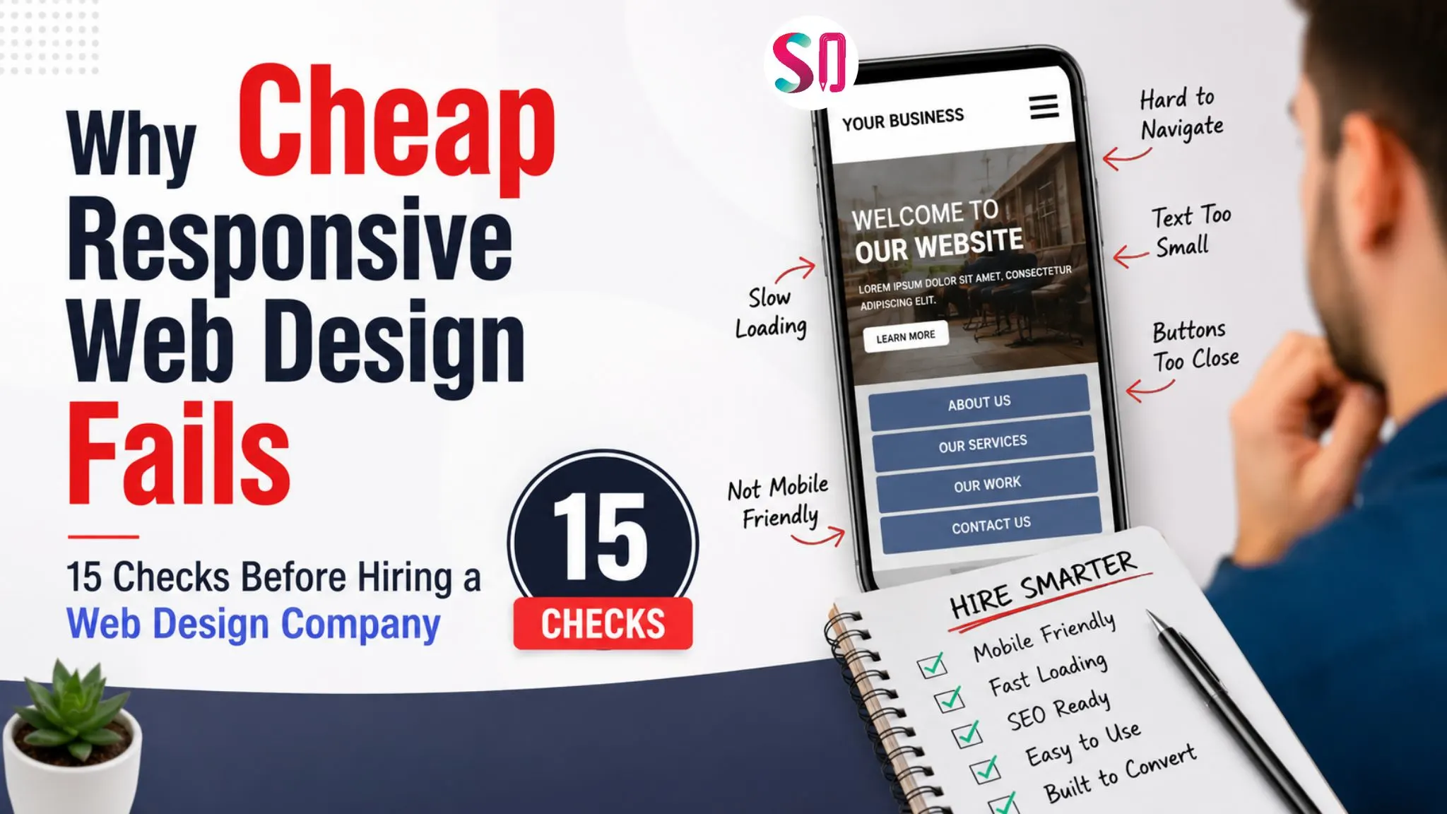
Why Cheap Responsive Web Design Fails: 15 Checks Before Hiring a Web Design Company
June 19, 2026- 19 Min Read
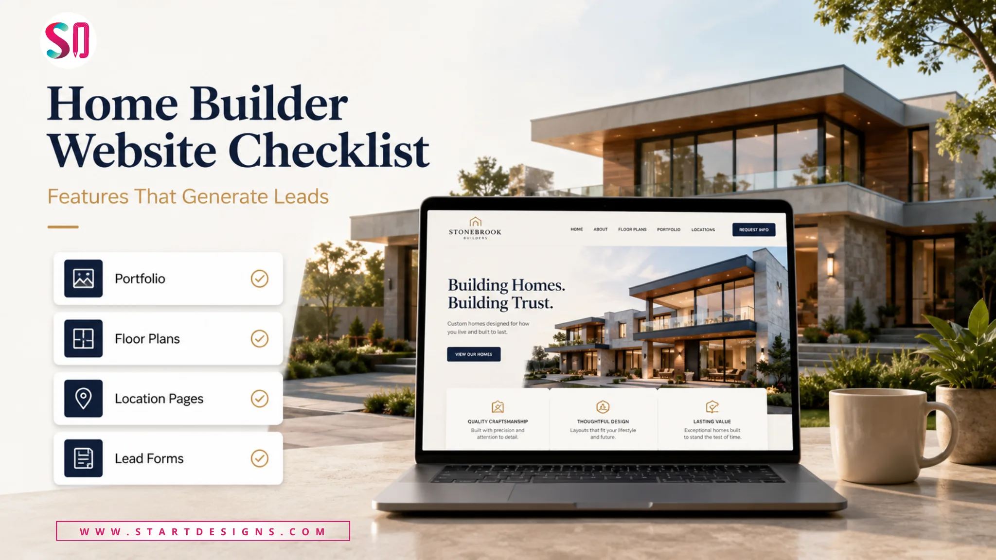
Home Builder Website Design Checklist: 25 Features That Generate Leads
June 17, 2026- 12 Min Read
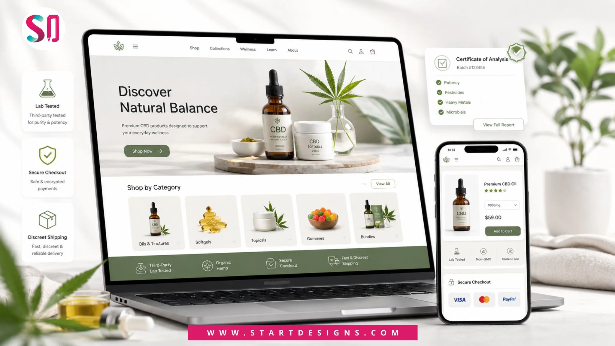
CBD Website Design: Complete Guide for CBD Brands & Ecommerce Stores
June 11, 2026- 17 Min Read