- About us
-
Services
- Back
- Development Services
-

-
-
-
- Designing Services
-
-
-
-
- Marketing Services
-
-
-
-
- Cloud Engineering Services
-
-
-
- ERP
-
-
-
- CRM
-
-
-
- Artificial Intelligence
-

-
-
-
- MVP
-
- Industry
- Portfolio
- Career
- Contact us
-
 info[at]startdesigns.com


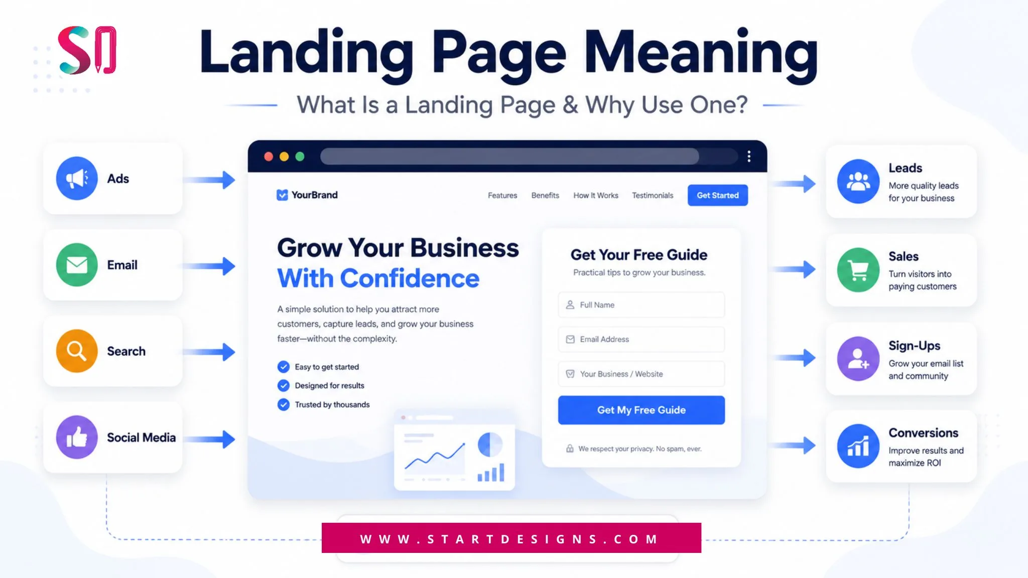
Introduction
When someone lands on your website, they are not casually browsing. They are making a decision.
In the manufacturing space, that decision carries even more weight. Buyers are not purchasing instantly. They are evaluating vendors, comparing capabilities, and looking for signals that tell them they can trust you.
This is where most manufacturing websites fall short.
Some overwhelm visitors with technical language. Others look outdated or make it difficult to understand what the company actually offers. In many cases, users leave before they even get clarity.
The best manufacturing websites take a very different approach.
They guide visitors step by step. They simplify complex products. They build trust naturally. And most importantly, they move users toward action without friction.
To understand what truly works, we analyzed some of the most effective manufacturing websites in 2026, not just from a visual perspective, but from a real user experience and conversion standpoint.
What Actually Makes a Manufacturing Website Effective in 2026
Before reviewing examples, it is important to understand a key idea.
Good design alone does not convert. Clear thinking does.
Every high-performing manufacturing website follows a few core principles that directly impact user behavior and conversion.
Clarity comes first
Within the first few seconds, a visitor should understand what you offer and who it is for.
Strong websites do not rely on vague taglines. Instead, they show the product in action and support it with a clear statement that connects to a real use case.
When this clarity is missing, users leave quickly.
Products are shown in a real context
Buyers want more than product images. They want to understand how the product fits into their environment.
Top websites show products installed, in use, and in real settings. Roof systems are shown on buildings. Equipment is shown in operation. Interfaces are shown in action.
This removes uncertainty and builds confidence.
Website Design Services!
Users should never feel lost.
The best manufacturing websites guide visitors based on their intent. Residential and commercial users are often separated early. Engineers and decision makers are given different paths.
When navigation becomes confusing, users drop off.
Trust is built at the right moment
Instead of pushing claims aggressively, strong websites present proof where it matters.
Client logos often appear near the top. Certifications are shown near product details. Case studies are introduced when users start looking for validation.
Timing makes a difference.
Every page leads to an action
High-performing websites do not leave users guessing.
Each page gives a clear next step. Request a quote. Explore a product. Speak to an expert.
This direction keeps users moving forward instead of dropping off.
Now that you understand the foundation of effective manufacturing websites, let’s break down real examples and see how these principles are applied.
Best Manufacturing Website Examples With Real UX Analysis
#1. CHI Overhead Doors
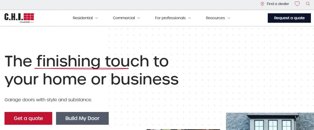
When you land on the CHI website, there is no confusion about what the company offers.
The homepage immediately focuses on garage doors and shows them in real environments. You see finished homes, commercial buildings, and installed products.
This approach does something important. It connects the product to its outcome.
Instead of explaining features, the website shows what the final result looks like.
Why this works
One of the most effective decisions on this site is how it separates users early.
Visitors are guided to choose between residential and commercial paths. This is more than a design choice. It is a conversion strategy.
A homeowner and a commercial buyer have very different needs. By separating them, the website reduces friction and helps users find relevant information faster.
Another strong element is the product configuration experience.
Users can explore options and visualize different choices instead of imagining them. This keeps users engaged and increases the likelihood of inquiries.
What you can learn from this
If you serve multiple audiences, guide them into separate journeys early.
Also, consider adding interactive elements that allow users to explore your products instead of just reading about them.
#2. Marley
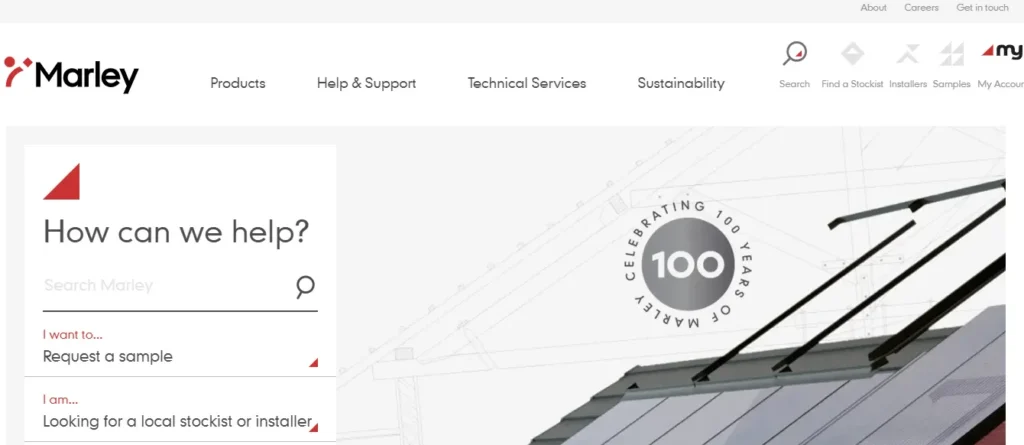
The Marley website makes an impact immediately through visuals.
Instead of starting with heavy text, the homepage shows a roofing system in context. Visitors instantly understand where the product is used.
This answers a key question before it is even asked.
Why this works
Marley does a great job guiding users through the site.
On the homepage, visitors are given clear options for what they can do next. Whether they want to explore products, find solutions, or learn more, the path is obvious.
This reduces hesitation.
Another strong point is the navigation structure.
Even though the site contains a large amount of information, the menu feels organized and predictable. Users can quickly find what they are looking for without feeling overwhelmed.
What you can learn from this
Do not assume users will figure things out on their own.
Guide them with clear paths and keep your navigation structured in a way that feels intuitive.
#3. VJ Technologies
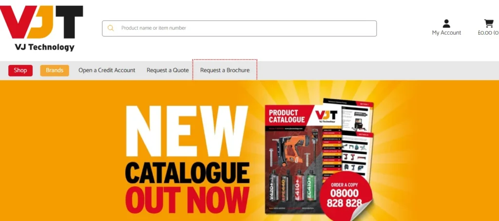
VJ Technologies takes a different visual direction with a darker interface that creates a premium and technical feel.
When you land on the homepage, bold headlines stand out clearly. Key phrases are highlighted, making the content easy to scan.
This design choice helps control attention.
Why this works
The site balances visuals and information effectively.
Instead of overwhelming users with long paragraphs, it combines strong imagery with concise explanations. This makes complex information easier to understand.
Another interesting decision is how navigation is handled.
Important pages and key actions are visible without needing to open a menu. Secondary content is placed within the menu.
This keeps the main journey simple.
What you can learn from this
Design should guide attention, not just look appealing.
Use contrast, spacing, and hierarchy to highlight what matters most.
#4. Airthings
At first glance, the Airthings website feels simple. But that simplicity is very intentional.
The moment you land on the site, you are guided toward two clear paths. One is for home users, and the other is for business solutions.
This happens early, without forcing the user to think too much.
Why this works
The experience changes based on who you are.
If you enter as a home user, the website quickly moves toward product discovery and purchase. You see clear product options, features, and buying choices.
If you enter as a business user, the experience shifts. Instead of pushing products, the site focuses on solutions, use cases, and long-term value.
This difference matters because the intent is completely different.
Another strong element is how they present their technology.
They do not just claim that their product is smart. They actually show the interface and how the system works. This makes the product easier to understand and builds confidence.
What you can learn from this
Do not treat every visitor the same.
If your audience has different goals, create separate journeys that match their intent.
Also, if your product includes software or technology, show it clearly instead of describing it.
#5. Robin Radar Systems
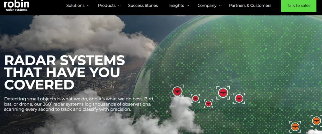
The Robin Radar website is a strong example of clarity and focus.
When you land on the homepage, you immediately see a clear statement explaining what the company does. There is no guesswork.
Right next to that message, there is a visual that supports it directly.
This combination answers two questions instantly. What is this and how does it help me?
Why this works
The solution pages are especially well structured.
Each solution is introduced with a clear heading, a relevant visual, and a focused explanation. You do not need to read everything to understand the core idea.
The site also uses spacing effectively.
Instead of filling every section with content, it allows space around key elements. This makes the experience easier to process.
Another smart decision is limiting how much information appears on product pages.
Only the most important details are shown upfront. Additional technical information is available through downloadable documents.
This keeps the page clean while still providing depth for users who need it.
What you can learn from this
Clarity always performs better than complexity.
Give users the right amount of information at the right time instead of trying to explain everything at once.
#6. Energy Park
Energy Park creates a strong first impression through motion.
When you land on the homepage, a video immediately sets the tone. It reflects their focus on sustainability and modern energy solutions.
But what stands out is what happens next.
The rest of the site becomes more product-focused.
Why this works
The homepage video builds an emotional connection. It gives visitors a sense of the brand’s purpose.
After that, the experience becomes practical. You start seeing real products placed in real environments.
This balance is important.
Too many concepts can confuse users. Too much product focus can feel dry. This site manages both.
What you can learn from this
Use visual storytelling to create interest, but always bring the user back to real products and real use cases.
#7. Packwire
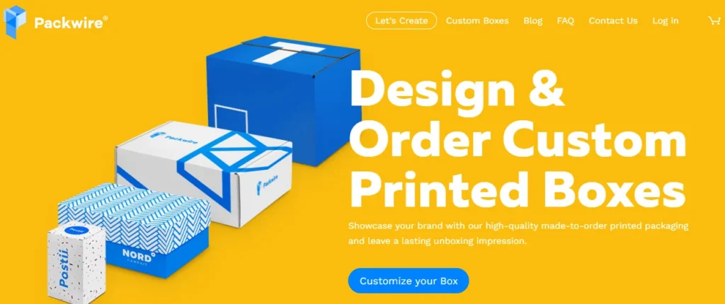
Packwire captures attention immediately.
From the moment you land on the homepage, the design feels bold and energetic. Colors, layout, and visuals stand out without feeling chaotic.
Everything feels intentional.
Why this works
One of the smartest decisions on this site is the placement of social proof.
Right below the main section, you see recognizable client logos. This builds trust within seconds.
Another strong element is how the page moves.
As you scroll, different packaging products are revealed smoothly and engagingly. The motion adds interest without slowing the experience.
The branding is also consistent throughout the site.
Every element, from typography to color choices, reinforces the identity of the brand.
What you can learn from this
Attention gets users in, but trust keeps them there.
Use design to attract attention, then reinforce credibility as early as possible.
#8. Hajster
Hajster takes a more creative approach compared to traditional manufacturing websites.
Instead of following standard layouts, the site uses motion and visual transitions to guide the user.
As you scroll, elements appear at the right moment, drawing your attention naturally.
Why this works
The experience feels refined.
This is not because of heavy graphics, but because of how everything is presented. Spacing, timing, and motion work together to create a premium feel.
Before even reading detailed information, the user already perceives the brand as high value.
What you can learn from this
Presentation shapes perception.
Even industrial products can feel premium when they are presented with attention to detail.
#9. Velux
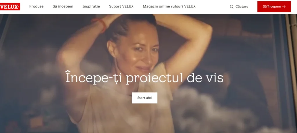
Velux focuses on showing products in real-life situations.
When you land on the site, you immediately see how their products are used inside homes and buildings. Natural light, interior spaces, and real environments are highlighted.
This creates an instant connection.
Why this works
Instead of listing features, the site shows outcomes.
You are not just looking at a window. You are seeing how that window transforms a space.
This makes it easier for users to imagine using the product.
Another strong point is how the site guides users toward action.
When you are ready to move forward, clear options are presented. You can explore products, request help, or make an inquiry without confusion.
What you can learn from this
Always show the result of your product.
Help users visualize the outcome, not just the features.
#10. Amazon Filters
Amazon Filters focuses on clarity and efficiency.
The site is designed for users who need information quickly and without distraction.
Why this works
The navigation is structured in a way that makes it easy to explore a large product range.
Users can move through categories smoothly without feeling overwhelmed.
The search function plays an important role here.
Instead of browsing endlessly, users can directly search for what they need.
Another strong detail is how visuals are used.
Large images are used when context is important, while smaller icons and product visuals are used when detail is required.
This keeps the experience balanced.
What you can learn from this
If you offer many products, make discovery simple.
Good navigation and search functionality can significantly improve both user experience and conversion.
#11. Siemens
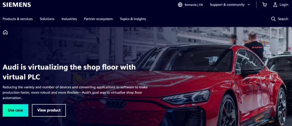
The Siemens website is a strong example of how to present complex industrial solutions in a simple and structured way.
When you land on the homepage, you are not immediately pushed toward products. Instead, you are introduced to industries and solutions.
This approach is intentional.
Why this works
Siemens guides users based on problems, not products.
A visitor looking for automation or digital manufacturing solutions is not thinking about product names. They are thinking about challenges and outcomes.
By organizing the website around solutions first, Siemens aligns with how buyers actually think.
Products come later in the journey, once context is clear.
What you can learn from this
If your offerings are complex, avoid leading with product lists.
Start with the problem, then guide users toward the right solution.
#12. Bosch Industrial
Bosch builds trust from the very first interaction.
When you open the website, it immediately feels reliable and professional. This is not just because of design, but because of structure and content placement.
Why this works
Trust signals are integrated throughout the site.
Certifications, global presence, and product quality indicators are placed naturally across different sections. They do not feel forced or promotional.
The layout also plays a role.
Information is presented in a clean and organized way, which makes it easier for users to absorb key details without effort.
What you can learn from this
Trust should not be limited to one section.
It should be built across the entire experience in a natural way.
#13. Caterpillar
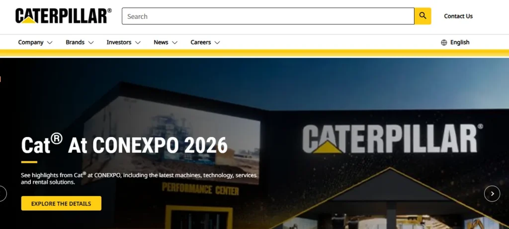
Caterpillar demonstrates the power of strong brand consistency.
From the moment you land on the homepage, everything feels aligned. Colors, typography, and imagery all reinforce the brand identity.
Why this works
The way products are presented makes a big difference.
Instead of showing machines as static items, the site presents them in action. You see them in real working environments, which reinforces their strength and reliability.
This creates a more powerful impression.
What you can learn from this
Consistency builds recognition and trust.
Make sure every page of your website feels like part of the same brand experience.
#14. 3M
3M focuses heavily on innovation and technology.
The website does not just present products. It highlights how those products are built, used, and applied across different industries.
Why this works
The content is organized around solutions and industries.
Visitors can explore how the company supports different sectors, which makes the experience more relevant.
Innovation is consistently reinforced across the site, strengthening brand positioning.
What you can learn from this
Do not limit your website to product features.
Show the technology and thinking behind your products.
#15. General Electric
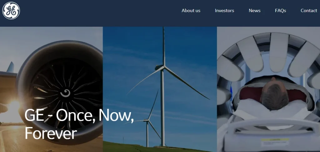
General Electric takes a storytelling approach.
The website feels less like a catalog and more like a brand experience. It combines products, projects, and real-world impact.
Why this works
Instead of focusing only on what they sell, the site shows what they achieve.
You see large-scale projects, industry impact, and real applications. This builds long-term trust and credibility.
It also positions the brand as a leader, not just a supplier.
What you can learn from this
People do not just buy products.
They invest in companies they trust and believe in.
Key Patterns Across High-Performing Manufacturing Websites
- When you look at all these examples together, clear patterns emerge.
- Websites that show products in real environments create stronger engagement.
- Websites with clear navigation help users move faster and reduce frustration.
- Websites that introduce trust signals early build confidence and reduce hesitation.
- Websites that guide users step by step generate more leads.
- These are not design trends. These are behavior-driven decisions.
Common Mistakes in Manufacturing Website Design
Many manufacturing websites still struggle with the same issues.
Overuse of technical language
Not every visitor is an engineer. If your messaging is too complex, users will leave before understanding your value.
No clear next step
If users do not know what to do next, they will do nothing.
Every page should guide users toward a specific action.
If it takes too long to find information, users will exit.
Navigation should feel simple and predictable.
Slow performance
Heavy images and poor optimization can increase load time and reduce conversions.
Speed directly impacts user behavior.
Lack of trust signals
Without proof, users hesitate.
Client logos, certifications, and real case examples build confidence.
Important Data That Supports These Decisions
- Buyer behavior in the manufacturing space is consistent.
- Most business buyers evaluate a company based on its website before making contact.
- Users tend to leave quickly if a website feels slow or unclear.
- Clear messaging and structured navigation significantly improve engagement and conversion.
- These are not assumptions. They reflect real user behavior.
Quick Self Audit Checklist
Use this to evaluate your own website.
- Can a visitor understand what you offer within a few seconds
- Are your products shown in real use cases
- Is your navigation simple and easy to follow
- Do you display trust signals clearly
- Is there a clear action on every page
- If any of these are missing, there is room for improvement.
Final Thoughts
The best manufacturing websites in 2026 are not just visually appealing.
They are clear, structured, and built around user behavior.
They help visitors understand, trust, and take action without friction.
If your website is not doing this, it is not just a design issue. It is a growth problem.
Want to Improve Your Manufacturing Website
If you are planning to redesign your website or improve conversions, focus on clarity, user journey, trust, and direction.
With the right approach, your website can become your most effective sales channel.
About the author
Popular Posts
Website Redesign Cost in 2026: Pricing Calculator, Hidden Costs & ROI Breakdown
May 12, 2026- 19 Min Read